Constructing the Pattern on the Sala de la Barca Ceiling

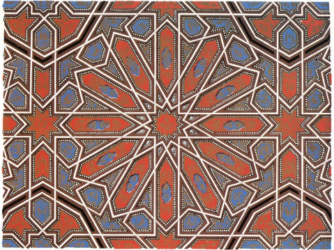
I was flipping through Owen Jones’s Grammar of Ornament a couple months ago, and my eye was caught by this handsome pattern I had not noticed before. This is Jones’s Plate XLII, in the chapter on designs from the Alhambra in Granada, Spain. He calls it, “Part of the ceiling of the Portico of the Court of the Fish pond.”

Since then I’ve kept out a clipboard with a compass and straightedge, and, in the small triangles of time after meals or before working on something else, I’ve slowly figured out how one might construct this. It’s less complicated than it looks at first, and at the same time, weirdly complex.

This post discusses how to construct this figure with compass and straightedge; the next post is about the mathematics of it.

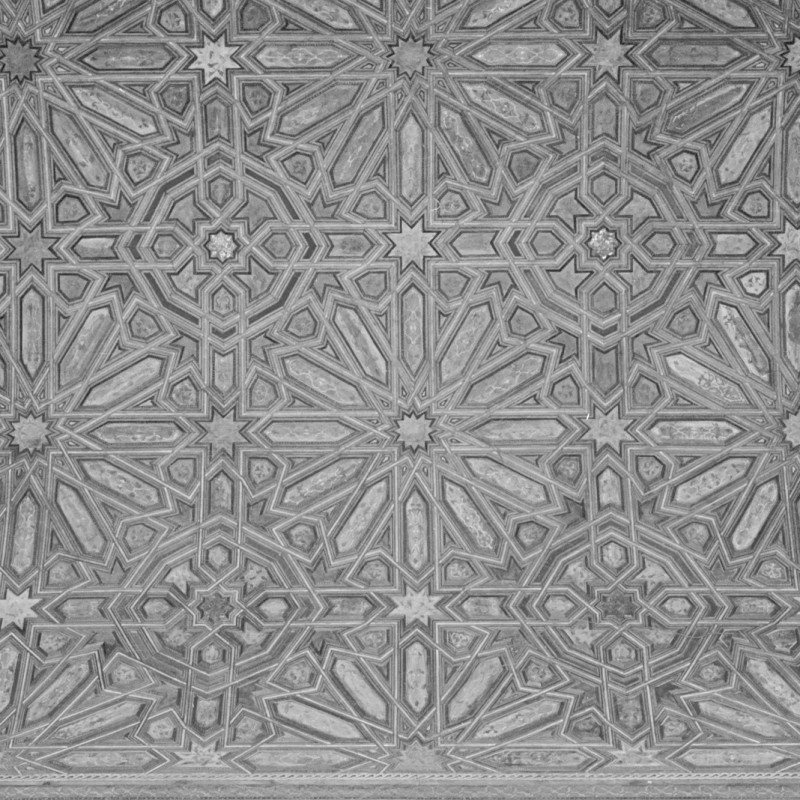
To get a bigger picture of what the original is, take a look at this beautiful photograph at the David Wade archive of the actual ceiling:

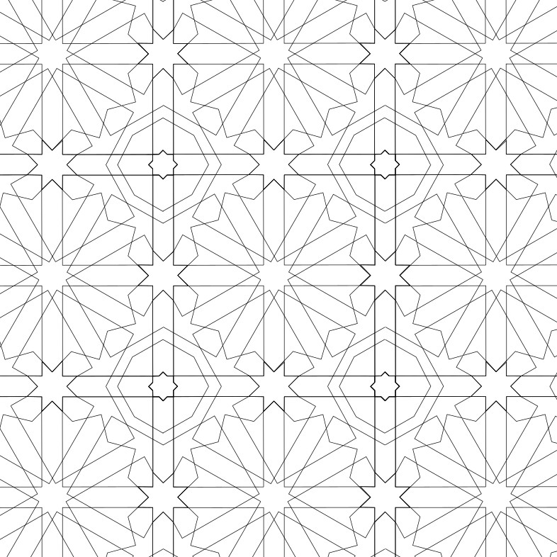
It turns out that it is constructed not on a flat surface, but on the inside of a barrel-vaulted ceiling. And it consists of multiple square repeat units, each holding a large 12-pointed star, arranged in regular rows and columns.

At Brian Wichmann’s Tiling Database (tilingserch.org), this pattern is called “Alhambra, Sala de la Barca,” and the notes say…

The shape of the ceiling of the Sala de la Barca is essentially cylindrical, with quarter spheres capping each end. Consequently the basically planar pattern has to be greatly modified where it covers the spherical surfaces at each end. The colours on the painted wooden ceiling are black, white, silver, brown and orange. The symmetry group of the tiling is *442 (p4m).

https://tilingsearch.mit.edu/HTML/data163/E755.html

And they have this rendering of the pattern, which shows that someone else has figured out how to construct it, even if they did not publish the method.

I found a photograph of the entire ceiling on the page for The Hall of the Boat at alhambragranada.org, so you can get a sense of the whole piece of work. The ceiling extends down a long, thin space.

The basic pattern, three full square repeat units with half a unit on each side, is rendered nine times down the main semi-cylindrical body of the vault. In the quarter-dome caps on each end, there is a single square repeat unit, with three half-units along the edge, and two triangular spaces cleverly filled in between these.

For now, I’m interested just on what’s going on with the regular square repeat units in the semi-cylindrical vault, the part we could actually unroll and lay flat. If you are interested in how they worked the pattern in the quarter-dome caps at each end, you can read more in Jay Bonner’s Islamic Geometric Patterns, p. 113 and p. 543.

Last, before going into the construction method, we should discuss where, exactly, this is in the Alhambra. We’ve seen it called “the ceiling of the Portico of the Court of the Fish pond,” “the ceiling of the Sala de la Barca” and the “Hall of the Boat.” Are these the same places?

A little research reveals that there is no Court of the Fish Pond, but there is a Court of the Myrtles that used to be called the Court of the Pond. At its northern end….

through a pointed arch of mocarabes, visitors may enter into the Hall of the Boat (Sala de la Barca). The origin of its name is the Arabic word baraka, which means blessing and which degenerated into the Spanish word barca, which means boat. This rectangular hall is 24 meters long and 4.35 meters wide, but was apparently smaller at the beginning and later extended by Mohammed V. A semicylindrical vault was destroyed by a fire in 1890 and it was replaced by a copy completed in 1964.

https://www.alhambradegranada.org/en/info/nasridpalaces/halloftheboat.asp

Interestingly, Jones’s drawing dates from before the 1890 fire, yet it differs slightly from what we see in photographs of the ceiling today. Tilingsearch.org cites Jones’s drawing as

Plate XLII+ (Alhambra, Sala de la Barca, Spain. Drawn incorrectly without a kink) from [jones]

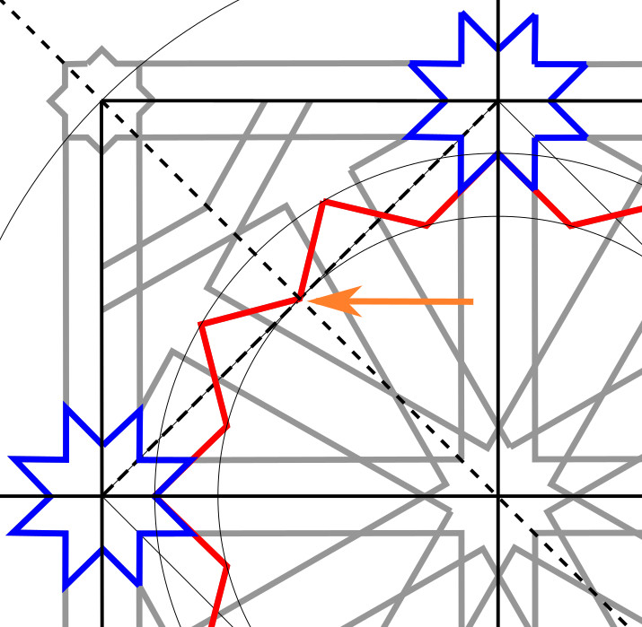
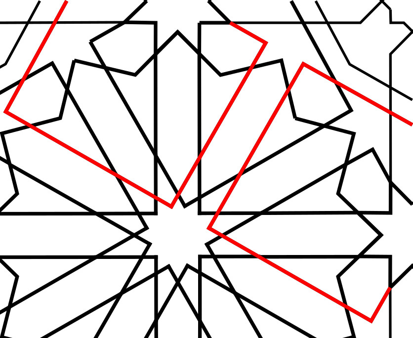
I was a long way into constructing this figure before I found what I think is the “kink” — and I don’t know if Jones got it wrong, or the builders of the copy in 1964 got it wrong. But there is a difference.

In today’s ceiling, the line coming off one of the vertices of the eightfold stars is aligned with neither side of the star, but rather with the octagons that appear at the corners of the repeat unit. As a result, the arrowhead shaped piece off the end of one of the rays of the 12-pointed star is symmetrical. In Jones, that line is aligned with one side of the star, and not with the octagon side, so the arrowhead shaped piece is asymmetrical.


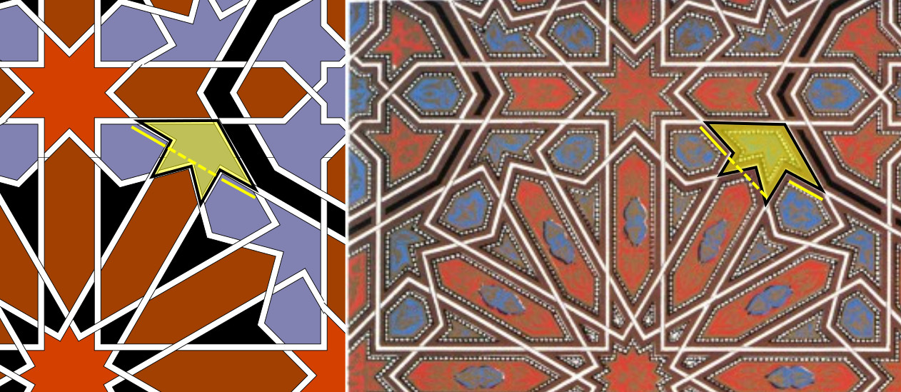
Rendering from tilingsearch.org (left), compared with Jones’s 1856 drawing (right).

My construction method goes with what we see on the ceiling today.

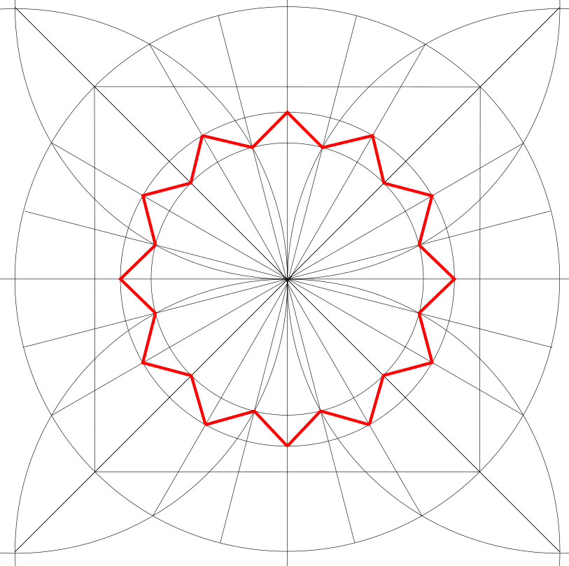
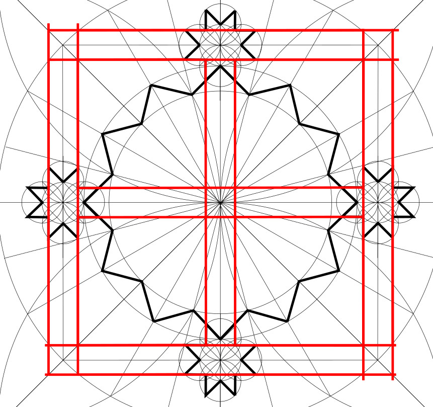
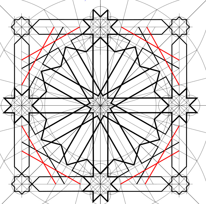
Technically, the repeat unit is just this much:

And there are much smaller repeat units of course: a quarter of the square would suffice. Even half a quarter of the square would suffice. But from the point of view of construction, it’s easier to visualize with the entire outer frame.

So let’s construct that.

Phase 1

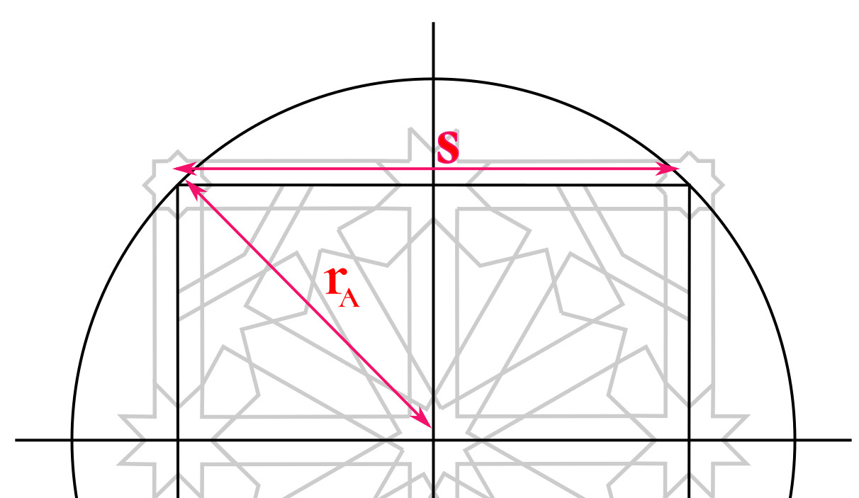
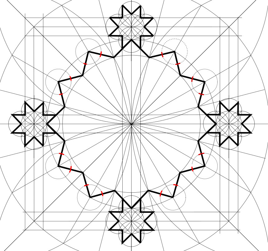
Draw an initial circle and establish within it the square which frames the basic repeat unit of the pattern. Then draw the outer edges of the 12-pointed star that dominates the centre of the pattern

  1. Draw a circle (“Circle A”).

2. Inscribe the master square within it.

2.1. Draw a horizontal line through the circle’s centre

2.2 Bisect it to make a vertical line through the same centre

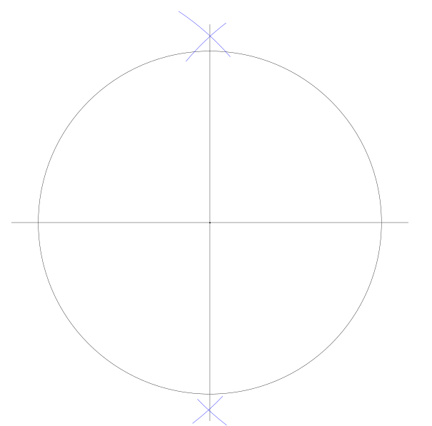
2.3. Draw four arcs (same radius as Circle A) centred on the four points of intersection between Circle A and the two lines just drawn.

2.4. Draw diagonals connecting the points where the arcs intersect outside Circle A.

2.5. Note where the diagonals intersect Circle A, and join those points to form the master square. You should now have this:

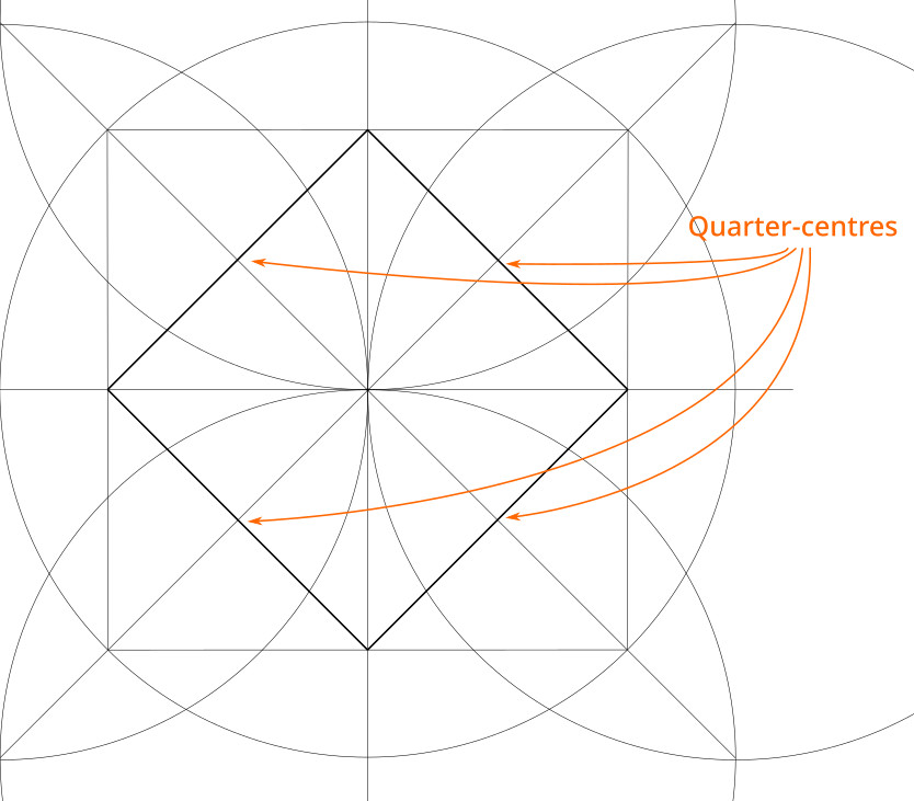
3. Locate the quarter-centres of the square. These are the centroids of each quarter-square.

3.1 Locate the midpoint of each side of the square.

3.2. Connect adjacent midpoints with diagonal lines

3.3. The quarter-centres are where the diagonals from step 2 above intersect the lines connecting the side midpoints. You should have:

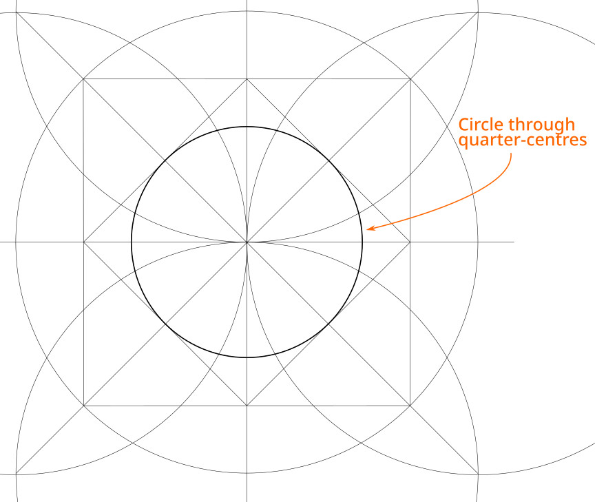
4. Draw a circle centred on the same point as Circle A, but through the square’s quarter centres (Circle B).

5. Draw the additional lines to split these circles into 24 equal segments. Getting these radiating lines evenly spaced will make the final pattern look much better, so it’s worth taking your time with this step.

5.1. So far we have already divided Circle A into 8 equal arcs using the horizontal, vertical and diagonal lines.

5.2. Eight more divisions can be made by connecting four pairs of points. They are the intersections between, on the one hand, the construction arcs we made for the master square, and, on the other, Circle A.

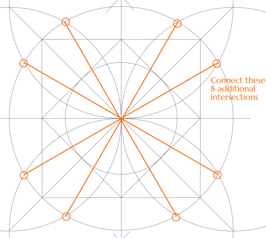
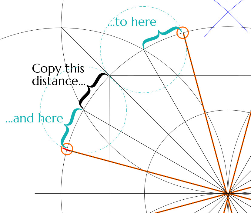
5.3. For the last eight points, there is no easy solution. However, we already have enough of the radial lines that we can just copy the interval between them onto the remaining arcs. You could also do this using the usual angle bisecting technique, but really it’s easier to just use a compass set to the span of one of the existing 1/24th arcs.

You should now have 24 radial lines, with 1/24th of the circle between each pair of them.

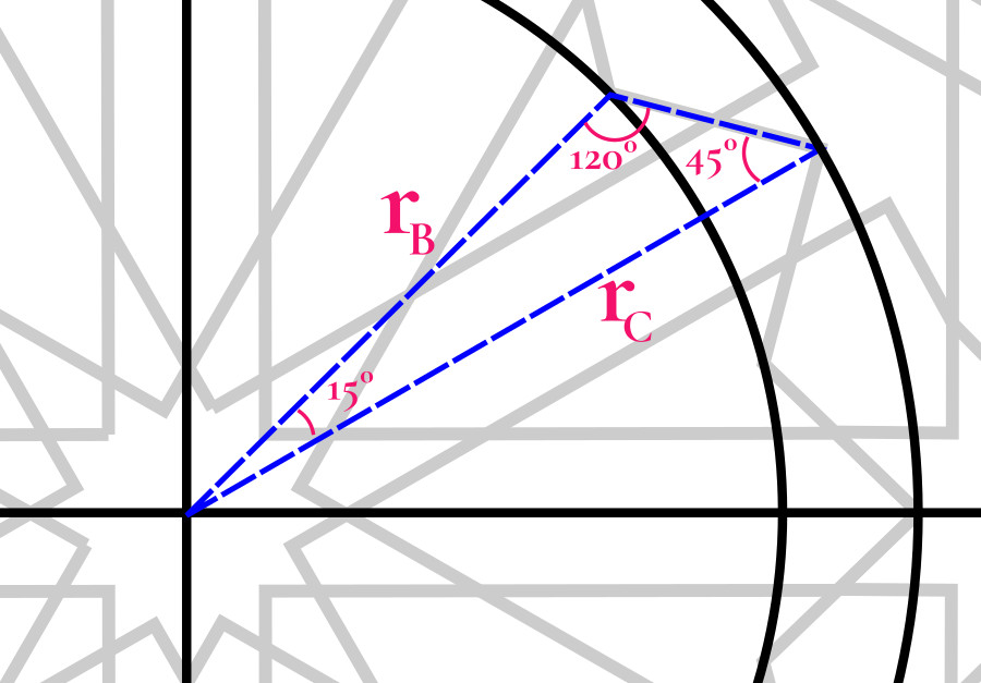
6. Observing where the radial lines intersect Circle B, construct a few lines between intersections that are four apart, extending them out to the next 1/24th radial. You really only need a few of these.

7. Now draw a circle (Circle C) going through these outer intersections.

8. Draw line segments alternating between circles B and C, starting at a quarter-centre of the square. You should get a 12-pointed star.

This is the first part of the pattern we will actually ink.

Phase 2

In the second phase, we establish the 8-pointed stars centred on the midpoint of each side of the master square, and then let them dictate the twelve pairs of parallel lines that make the star at the heart of the pattern. Also, we will draw the 8-pointed stars in the corners.

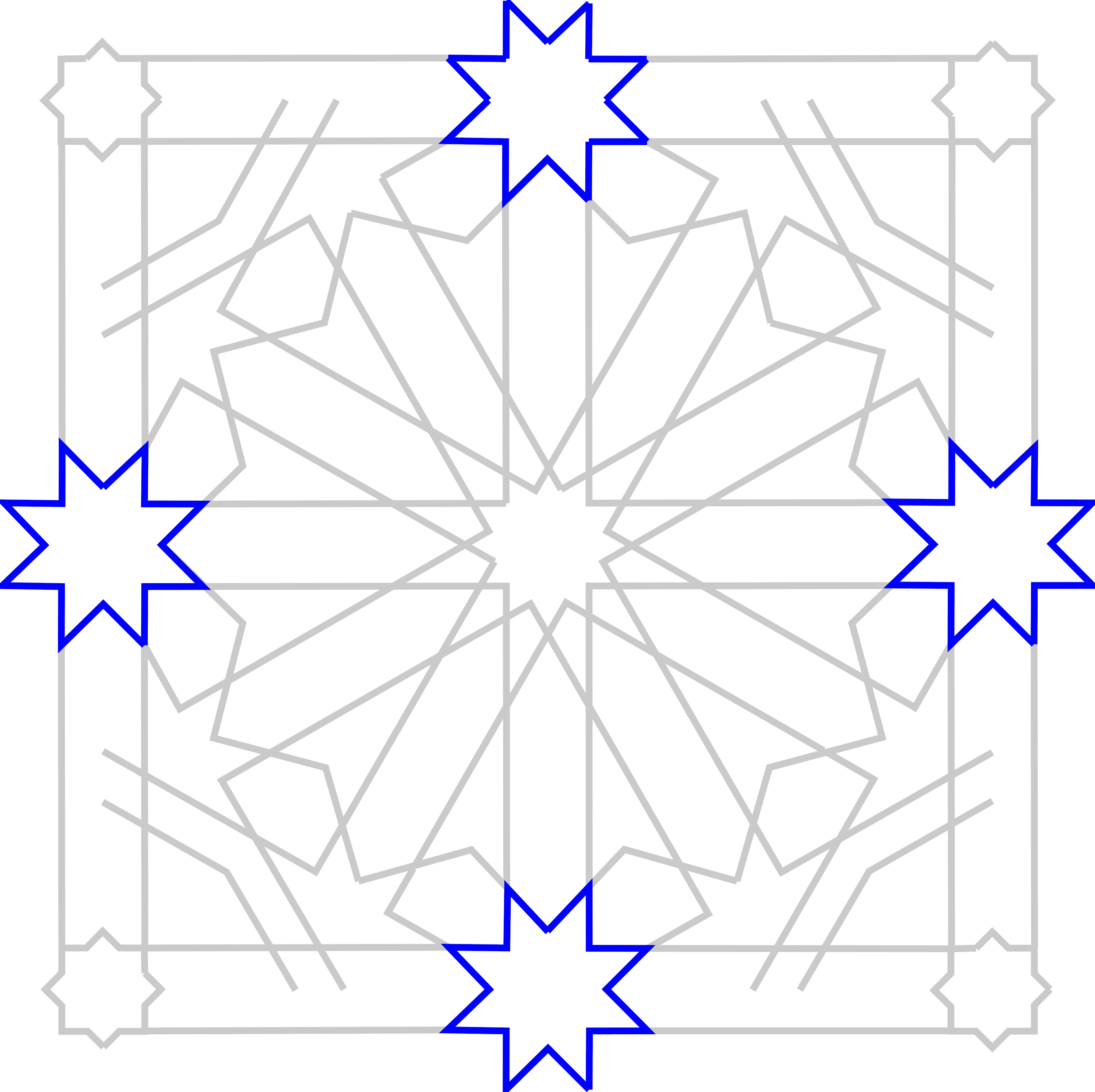
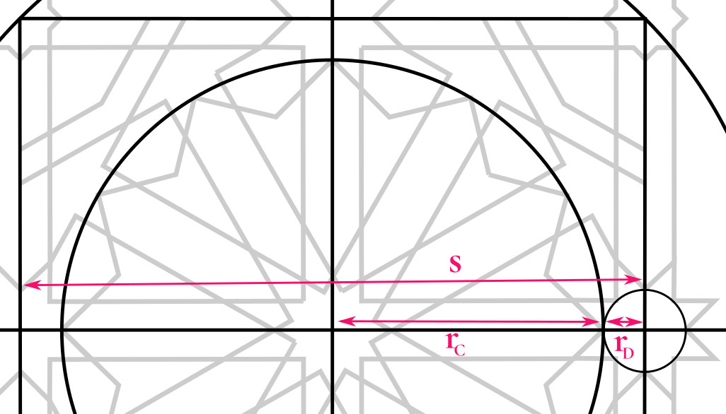
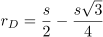
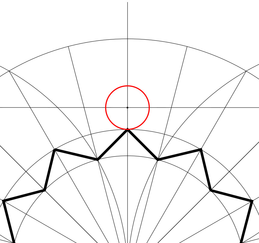
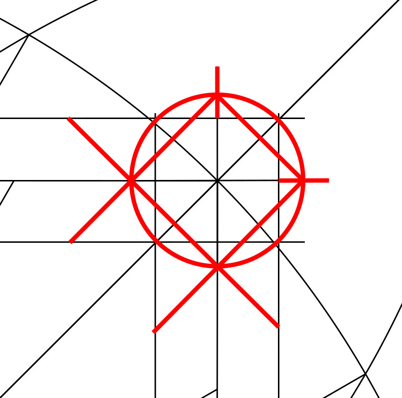
1. At the midpoint of each side of the master square, draw a circle centred on that midpoint whose radius just touches the nearest approach of the 12-pointed star we’ve drawn. We’ll call this Circle D. We’ll be drawing a lot of circles with the same radius as Circle D over the next few steps.

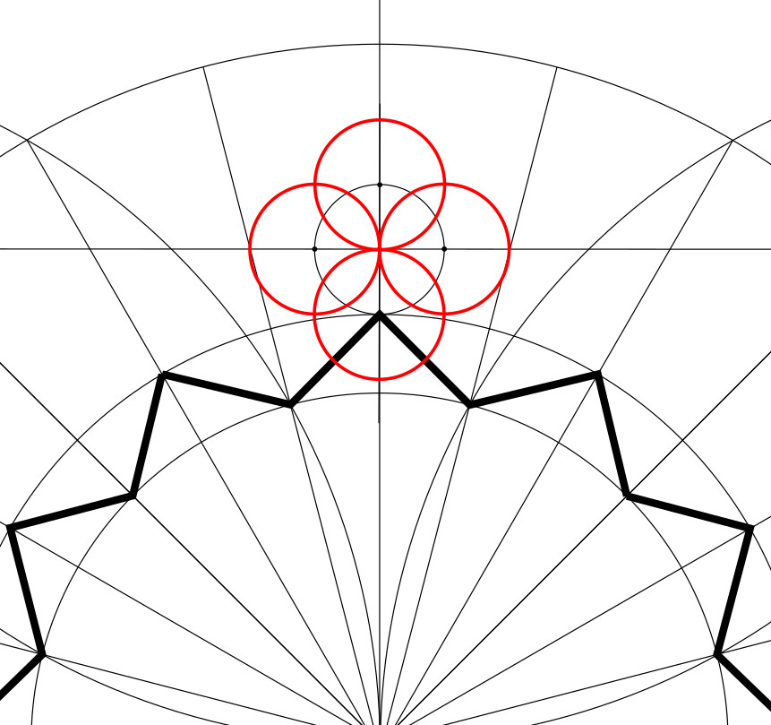
2. For that circle, draw circles of the same size centred on each of the four cardinal points.

3. Then draw diagonals through adjacent circle centres and intersections. This allows you to identify 8 evenly-spaced points around Circle D.

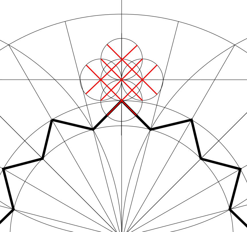
4. Trace the lines of the 8-pointed star. These are inkable.

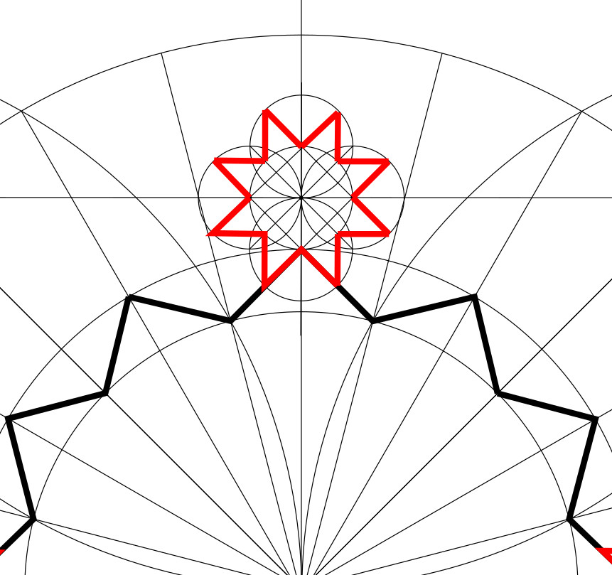
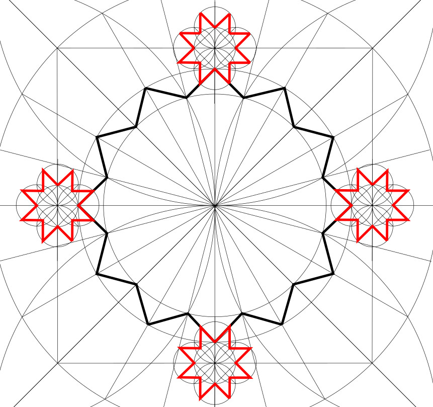
5. Repeat to create 8-pointed stars on the other 3 sides of the master square.

6. Extend the 8-pointed star sides in parallel pairs, to create channels that run across the master square and along its sides.

7. Now we need to draw four more pairs of parallel lines crossing the 12-pointed star. Using the same radius as Circle D, mark out two points on either side of each vertex of the 12-pointed star. (No need to do the vertices that already have an eight-pointed star adjacent to them.)

8. Connect corresponding pairs of these marks to make four more pairs of parallel lines. Extend these lines until they hit the master square.

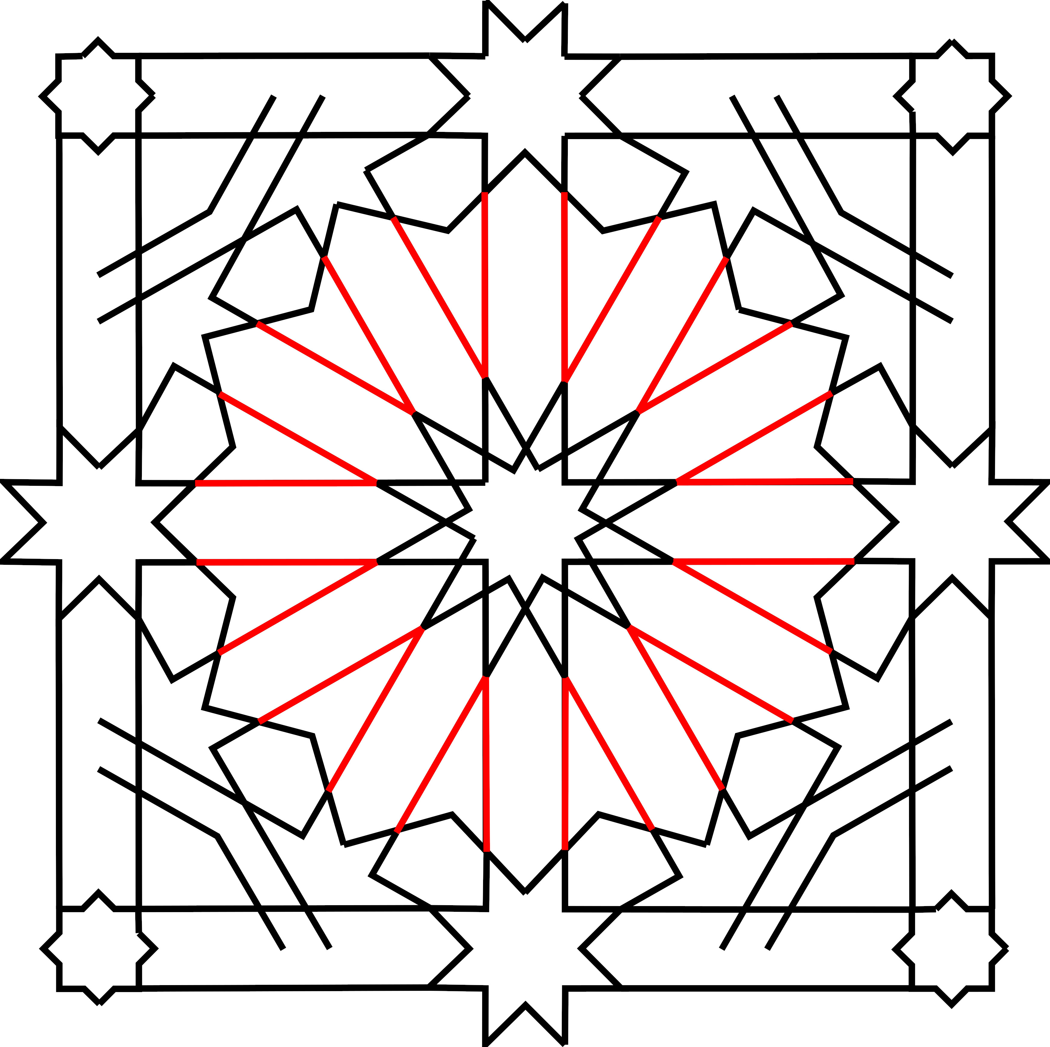
9. Ink these lines inward from the 12-pointed star, stopping where they meet partners that are perpendicular to them. You should have twelve channels within the central star, emanating from another 12-pointed star at their centre. Each channel has the same width, and this width is shared with the channels framing the master square.

10. At each of the small corner squares formed by outer frame channels (drawn in step 6, above), draw a circumscribed circle. (It’s the same radius as Circle D.) Extend the sides of the master square to intersect the far sides of this circle. Noting the cardinal points of the circle, connect adjacent ones as shown, so diagonal lines extend into the framing channel.

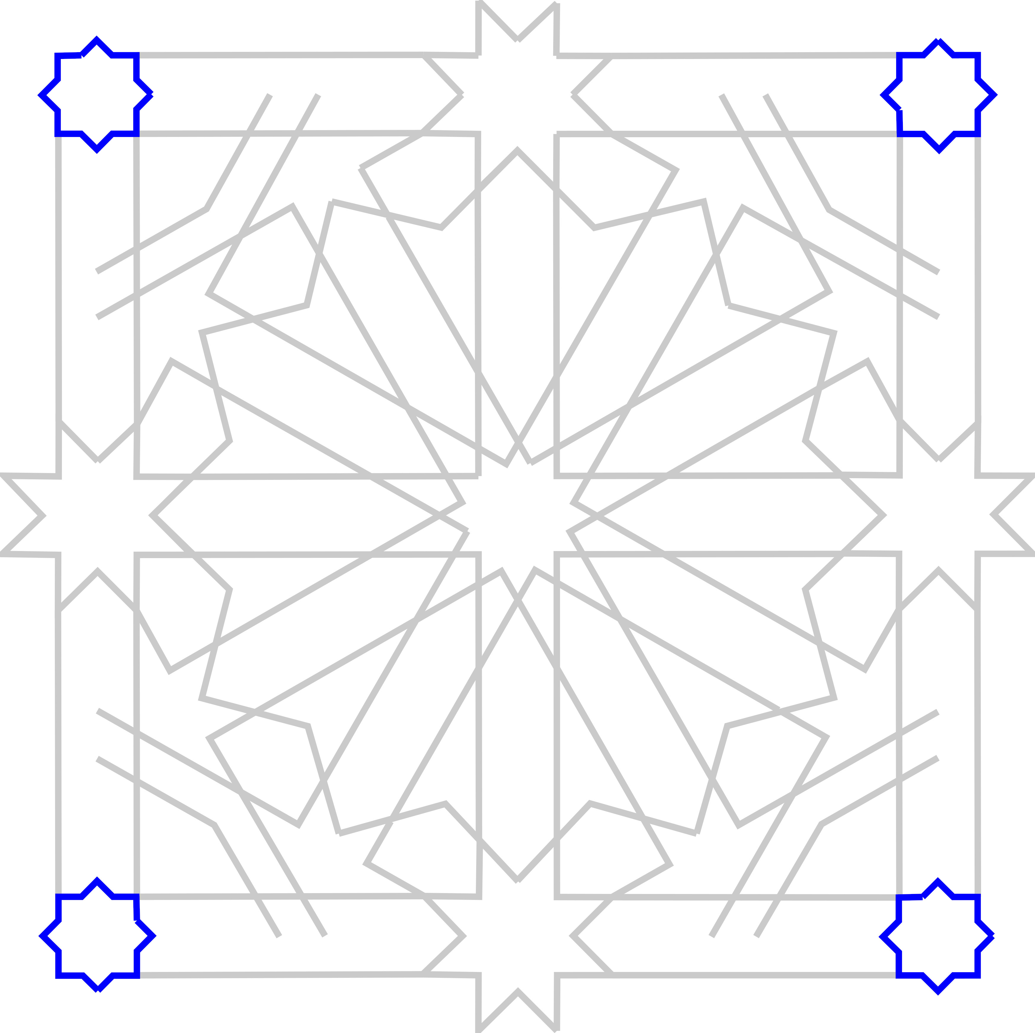
11. Ink in an 8-pointed star inside each circle.

12. And ink in the parallel lines extending from the stars in the middle of each side of the square, as shown.

Phase 3

In the final phase, we will fill in the corners.

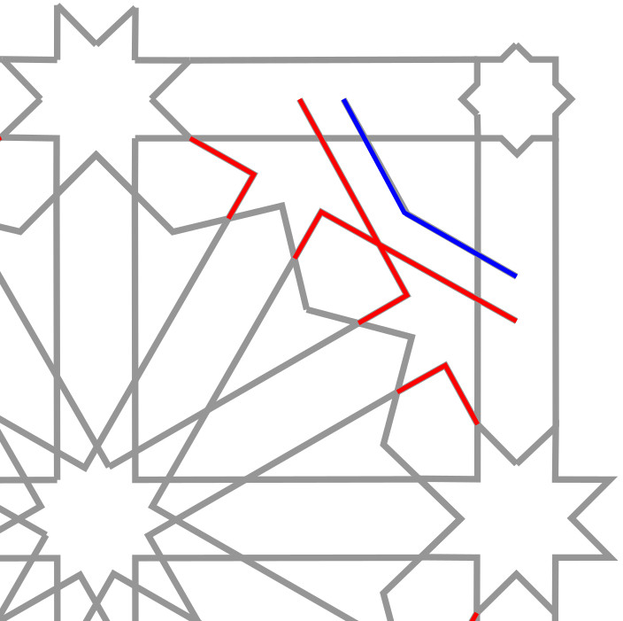
1. Draw construction lines for the corners. As shown below, there are two lines in each corner. They both go from the tip of one of the mid-side-8-pointed stars to a specific intersection where the master square meets one side of a channel. (This is actually slightly wrong, but the error should be imperceptible. See Part 2 for a discussion of what’s going on here.)

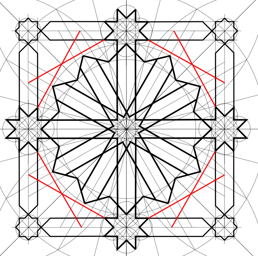
2. Ink extensions of the channel lines out of the 12-pointed star and turning through a right angle onto one of these construction lines just drawn, as shown below.

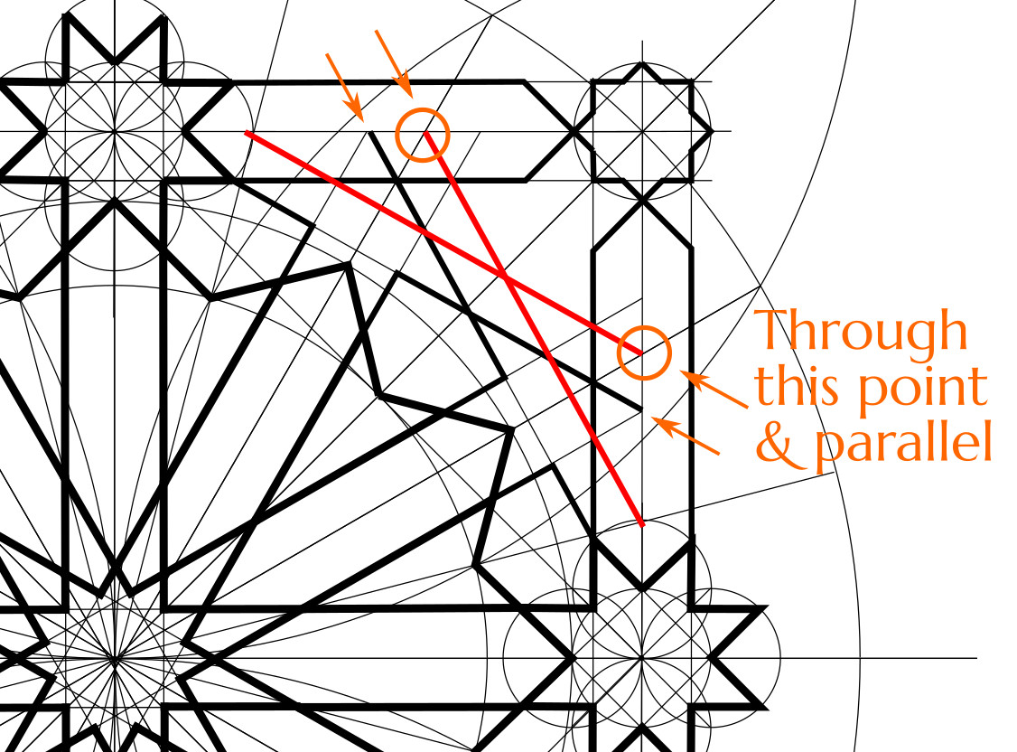
3. Draw similar construction lines for the octagons. This is the only part of the pattern for which you need to draw a line without having two specific points to connect. You have one point, which is where a 1/24th radial, at either 30° or 60°, hits the master square. Through that point you need to draw a line parallel to one of the construction lines drawn in step 1.

4. Ink these in as shown.
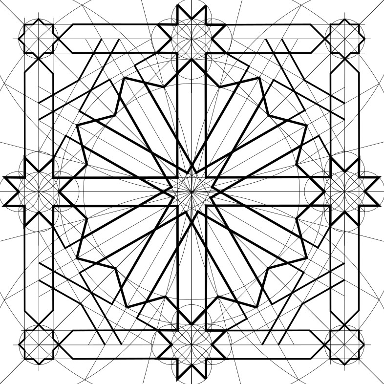
And you’re done!

You now have a completed pattern which you can repeat above and below, as far as the space you need to fill. The frame provides an overlap for aligning adjacent tiles.

Now, having done all of that, you probably would like to know why we did some of the things we did. Why did they work?

If so, read on to Part 2.

The Mathematics of the Pattern on the Sala de la Barca Ceiling

(This is the math geek part about the Sala de la Barca ceiling. For instructions on constructing the pattern with compass and straightedge, go over to Part 1.)

In the process of figuring out how to draw this pattern, I ran into a lot of questions, and had to do more than a little math to answer them.

Two families of symmetry

One of the most interesting things to notice about this pattern is that it includes two distinctly different types of symmetry. There’s twelvefold symmetry inside the frame, but there’s eightfold symmetry on the frame.

They’re not incompatible, but eightfold and twelvefold patterns do things a bit differently. The eightfold stars have lines at 0° (horizontal), 45° and 90° (vertical), but the twelvefold stars send out lines at 0°, 30°, 60° and 90°. So we shouldn’t be surprised if there will be some weird little shapes in the corners where the 30° and 60° lines coming out of the twelve-fold stars meet and blend into the 0°, 45° and 90° lines coming out of the frame. Maybe a little hanky-panky to make it all work. More on that later.

Let’s look at the twelvefold part first. The major feature inside the frame is the 12-fold star. But this star is actually composed of two stars.

One is the {12/3} star that forms the outside of what we initially see as the star.

The {12/3} star

The notation “{12/3}” (a Schläfli symbol) tells us that there are 12 vertices equally spaced around a circle, and the star is generated by stepping around these vertices hitting every third one.

If you’re familiar with the stellations of a dodecagon (there’s a nice chart on the Wikipedia page), this one is recognizable as the {12/3} star because the internal angles of its vertices are 90°.

The other component is the {12/5} star that sits in the centre. It’s recognizable as a {12/5} star by its vertex internal angles of 30°.

The sides of the {12/5} star have been extended outwards in parallel pairs to the {12/3} star, forming 12 channels.

All of this twelvefold symmetry is set in a square frame based on eightfold symmetry. The frame is made from channels of parallel lines. The width of these channels is the same as that of the channels extending from the {12/5} star.

The frame has {8/3} stars at the midpoints of each side. The {8/3} stars are sized so the channels are extensions of their sides, as are the cardinal (North, East, South, West) channels coming out of the {12/5} star.

At the corners of the square are {8/2} stars, also sized to match the channels.

Dividing the circle in 24

The first challenge of drawing this pattern was divide a circle into 24 equal parts. (Twelve for the twelvefold symmetry, but then 24 because the halfway divisions are very useful too.)

By the time we got to phase 1, step 5.2, we already had the circle divided into eight parts (i.e., at 0°, 45° and 90° in each quadrant) simply by virtue of having drawn a square in it.

But how then to get the important lines at 30° and 60°? One can’t trisect an angle, so we can’t generate them by trisecting the right angle in each quadrant of the square. Instead, we got them by drawing through points A & B, as shown below.

But why does this work?

It works because A & B are intersections between circles that share the same radius and have their centres on each other’s edges.

Just as in the classic construction of a hexagon, equilateral triangles are made and it’s easy to show that the two angles have to be 30° and 60°.

Then, to finish up getting the full 24 divisions of the circle, we also needed lines at 15° and 75°. I have seen people suggest that in this case you can draw through the intersections of those same arcs with Circle B (points C & D, below).

But this doesn’t really work. The result is not 15° and 75°. This becomes apparent when we construct a triangle like this…

We’d be hoping that the two angles at the base of this isosceles triangle would be 75°, leaving a perfect 15° between point C and the x-axis.

But in fact for such an isosceles triangle, where the two equal legs are twice the length of the base, the peak angle is…

…leaving 75.5225° for the two base angles. The complementary angle is 14.4775°. It’s close to 15°, but not quite right. And visibly so: if you draw the actual 15° line next to it you can see the difference.

So we resorted to copying the arc length for 15° from other parts of the circle.

How many independent variables are there?

It does initially look like the width of the channels is more or less independent of the length of the side of the square. It appears one could, for example, narrow the channels and make a variant pattern where the {12/5}, {8/3} and {8/2} stars shrink, and the {12/3} star grows larger. Something like this…

However, in the Sala de la Barca ceiling there’s no such latitude. The proportions of the twelvefold pattern inside the square, and the eightfold pattern of the square frame itself, are locked together by the fact that the dimples of the {12/3} star at the semi-cardinal points (NE, SE, SW and NW), fall exactly on the quarter-centres of the square.

This is why we drew Circle B through the quarter-centre of the square, and then built the {12/3} star outside it.

This requirement fixes the size of the {12/3} star relative to the square. The size of the {8/3} stars then depends on the space between the {12/3} star and the square. And the size of the {8/2} stars, the width of the channels that frame the pattern, and the width of the channels that emanate from the {12/5} star all depend on the size of the {8/3} stars. The whole thing is connected. Once you draw one part, you’ve determined the size of all parts.

Building a {12/3} star on its inscribed circle

In Phase 1, step 6, we determined the radius of Circle C (which is the circle circumscribed around the {12/3} star) by drawing line segments between points on Circle B, and extending them out until they met. Circle B was divided into 24 equal arcs, and we joined points in a skip-4 pattern. The intersections of the extended lines told us where Circle C was. Why did this work?

As noted above, we knew that Circle B was the inscribed circle for a {12/3} star. Our problem was how to generate a {12/3} star on it. It’s a problem in what I would call outward step stellation (as opposed to either inward stellation or outward jump stellation).

Outward step stellation takes us from one stellated figure to the next by extending sides. For example, you can stellate a {12/1} star (aka a dodecagon) outward into a {12/2} star. You do it by extending sides until they meet.


Dodecagon sides in black (left), extended (in red) to their first meeting. They form a {12/2} star (right). Note that, in the process, the first figure’s circumscribed circle became the second figure’s inscribed circle.

With the new {12/2} star, there’s still a vertex every 30° as you go around, but the vertices have been offset by 15°, or 1/24th of a circle.

The dodecagon had interior angles of 165°; the vertices of the new {12/2} star have interior angles of 120°.

Now, we draw a new circumscribed circle around the {12/2} star, and then we are ready to stellate outward one more step. We get a {12/3} star by extending the sides to their next meeting.


The {12/2} star’s sides extended to make the {12/3} star. The {12/2} star’s circumscribed circle becomes the {12/3} star’s inscribed circle.

The {12/2} star had interior angles of 120°; the new {12/3} star has interior angles of 90°. The vertices are back on the original 1/12th divisions.

It was this, the second outward step of stellation, that we called into play to get from Circle B to Circle C.

Circle B was the inscribed circle of a {12/3} star. Therefore it was the circumscribed circle of a {12/2} star. If we could draw just a few sides of that {12/2} star, and extend them to where they met, we would see where the {12/3} star’s vertices were going to be.

With a {12/2} star, sides join points on the circle that are 2/12ths apart.

That’s also 4/24ths apart.

Since we had our circle divided into 24, we could locate suitable pairs of points for a {12/2} star by skipping ahead four, and then extending them out.

This turned out to be a straightforward way to generate a {12/3} on Circle B.

The ratios

The math to calculate their relative sizes of the elements is not terrible. From a mathematical point of view, we should probably take the radius of Circle D as 1, and express the sizes of the other elements in terms of that. But from a design point of view, we are likely to need to base everything on the size of the square, so we’ll start with that.

If the side of the square is s units, then we know the radius of Circle A.

The radius of Circle B is then half of that.

As we go from the circle circumscribed around a {12/2} star (Circle B) to the circle circumscribed around a {12/3} star (Circle C), we can calculate the proportional amount by which the radius increases.

Hence…

And we can calculate the radius of Circle D because it is the space left between Circle C and the master square.

So rD is about 0.066987 times s.

The width of the channels will be √2 times that:

…or about 0.094734 times s. So if your square is 100 cm on a side, your channels should be about 9.5 cm wide.

Now we can go backwards and express everything in terms of rD. If rD is 1, we get…

Drawing the channel lines

Drawing the channel lines that run North–South and East–West was easy because we were simply extending the sides of the {8/3} stars. But to generate channel lines at 30° and 60° we employed the technique of copying Circle D onto each vertex of the {12/3} star.

But those places where the channel lines will hit the {12/3} star: aren’t they just the midpoints of the sides of the {12/3} star?

They are very close. But not exactly. We can prove that.

Just as when they are coming into an {8/3} star, the channel lines hit the sides of the {12/3} star a distance of rD down from the vertex point.

For this to be the midpoint, then each side of the {12/3} star would have to be twice rD. We can figure out the side of the {12/3} star from the triangle we drew above.

Whereas…

So the length of a side of the {12/3} star is almost twice rD, but not quite.

Constructing the lines in the corners

In the corners we need construction lines for what I think of as the “wings,” (in red below) and the octagon (in blue).


Wings” (red) and octagon (blue)

Both the pattern at tilingsearch.org, and the photograph from the Wade archive, suggest that these lines are extensions of lines in the adjacent stars.

This makes sense—everything in the pattern should be at 0, 30, 45, 60 0r 90°—and these lines falling on one of those headings makes them parallel to other arms of the star, and produces the pleasing square motifs that catch your eye.

Maybe it’s just me, but I kind of like these squares.

It also means the channel in the octagon is half the width of the main channels, which seems like a nice relationship.

But, I find it a little mathematically creepy that a line extended from a {12/5} star should hit the vertex of an {8/3} star on the border of the next pattern. Would it really?

Let’s construct the triangle XYZ as seen below, spanning two adjacent full patterns. We’re curious about the angle θ, which should be 30°. If we can determine the lengths of the two legs of this right triangle, h and t, we can compute the ratio t/h and compare it to the tangent of 30°. We should get:

First we’ll calculate h, the horizontal leg of the triangle between vertex Y and vertex Z. The distance between two pattern centres is s, so

Calculation of g is straightforward. Vertex X is at the point of the {8/3} star, so

Bearing in mind the definition of rD we worked out above,

If s = 1, g is about 0.114237.

Calculating j is a bit more involved. We start by noting that vertex Z falls on the circle inscribed in the {12/5} star, which we can call Circle E. So j is the radius of Circle E (rE) .

From the discussion of outward step stellation above, we know that if Circle E is the circle inscribed in the {12/5} star, it is also the circle circumscribing the {12/4} star. Because there are specific ratios between successive stellations, we can get the radius of Circle E (rE) if we first get the radius of the circle inscribed in the {12/4} star, Circle F. We’ll call its radius rF.

The {12/4} star was generated in the first place by the intersecting channels of width C, so we can see that rF is closely related to C.

And then it remains to figure out the relationship between the inscribing and circumscribing circles for a {12/4} star. The key point is that a {12/4} star has inner vertex angles of 60°.

Hence

That’s a surprising and elegant relationship, that Circle E, which is never drawn but is readily apparent to the eye, has the channel width as its radius.

Now we can calculate h:

That’s ugly! But it’s usable. If s = 1, h is about 0.790911.

The other leg of the triangle is of length t:

So, bearing in mind the definition of C above, we have

If s = 1, t is about 0.452633.

If we divide t by h, we get

We were hoping for the tangent value of 30°, or 0.577350. Instead we get 0.572293, which turns out to be the tangent value for an angle of 29.78°. Just a hair shy of 30°.

In other words, if you extend the channel line from an adjacent star, a line that really is at 30° to the horizontal, it would come in a bit high for the vertex X in the diagram above: 3.5 mm high in a pattern where s, the side length, is 100 cm.

Although I was pretty picky above, on the difference between 14.4775° and 15°, here I’m going to say that this angle difference (29.78° vs. 30°) is close enough for practical purposes — given that in the real world materials are coarse, and geometric pattern lines typically have significant thickness. Introducing a tiny “course correction” as the construction line crosses the boundary between adjacent patterns, a correction of about half a degree, is not going to be noticeable. It helps that the channel line does not extend to the pattern boundary, so you don’t see the course correction.

Hence in Phase 3 I created the construction lines in the corners by connecting the tip of one of the mid-side {8/3} stars to a specific intersection where the master square meets one side of a channel.

Conclusion

Well, it’s probably time to wrap up this overly long post. If you are here, thanks for reading to the end! It might not hurt of someone double-checked my math…

Transforming French WW1 Lambert Coordinates to WGS84

Nord de Guerre

Here’s a survey plat made in 1919 by a US Army unit in France.

In the aftermath of WW1, teams of American military surveyors produced these as they went around France mapping the grave sites of fallen soldiers.

On this plat we can see a number of bearings and distances from the I.P. (Initial Point), which is a small triangle at the centre of the image above. The bearing to the grave of Private Joseph A. Cain, for example, is “S 55°40′ W 598.5.” This means 55° 40′ west of due south — although we have to bear in mind that it was magnetic south, and specifically the magnetic south of 1919 in this location — at a distance of 598.5 feet.

The “I.P.” itself is a copper nail whose approximate coordinates tie the whole plat to a larger coordinate system. But its coordinates are given as the enigmatic N 296.80, E 309.02. What do these numbers mean?

They are French Lambert coordinates of the World War 1 era, more properly known as coordinates in the Nord de Guerre projection. They were used extensively in the mapping done by the French, British and American armies during the war. Clifford Mugnier, in his 2001 article on the history of grids and datums in the French Republic, gives us the parameters of the projection:

On the other hand, the French Nord de Guerre Zone (1914-1948) was used, and it was based on the French Army Truncated Cubic Conic where the Latitude of Origin was φ0 = 49° 30′ 00″, the Central Meridian was λ0 = 7° 44′ 13.95″ East of Greenwich, the Scale Factor at Origin (m0) = 0.999509082, and the False Easting was 500 km and the and False Northing was 300 km. The ellipsoid of reference was the Plessis Reconstituted.

Mugnier, Clifford, The French Republic, PHOTOGRAMMETRIC ENGINEERING & REMOTE SENSING, January 2001, pp. 33-35

These are welcome numbers to anyone who might want to re-create this projection. But if you aren’t doing that, you could still summarize it as follows: Lambert coordinates are in kilometers, and they are relative to an origin point at 49° 30′ N, 7° 44′ 13.95″ E. However, this origin is not N 0.00,E 0.00, but has been assigned N 300.00, E 500.00. This ensures that all coordinates within the area they are mapping will be positive.

The Nord de Guerre grid. (Modern international boundaries shown.)

(Ironically, the origin of this coordinate system was inside Germany.)

If having a central meridian at 7° 44′ 13.95″ east of Greenwich seems weird to you, understand that the French didn’t use the Greenwich Meridian. They used the Paris Meridian — a line through the Paris Observatory — which was 2° 20′ 13.95″ (or 2.33720833333333°) east of Greenwich. The central meridian of this Lambert coordinate system was then a further 5° 24′ east of that. That’s not a logical number either, until you realize that the French also weren’t using degrees: they were using grads. A grad is one four-hundredth of a circle, so 5° 24′ is exactly 6 grads. Hence the central meridian is the common-sense “six grads west of Paris.” If you add 5° 24’ to 2° 20′ 13.95″ you get 7° 44′ 13.95”.

In QGIS, you can see that the PROJ library comes with a definition for this historic projection: “ATF (Paris) / Nord de Guerre.” It looks like this:

+proj=lcc +lat_1=49.5 +lat_0=49.5 +lon_0=5.4 +k_0=0.99950908 +x_0=500000 +y_0=300000 +a=6376523 +rf=308.64 +pm=2.33720833333333 +units=m +no_defs

In that PROJ definition you can see the parameters that Mugnier described. lat_1 and lat_0 are 49.5°, a.k.a. 49° 30′ . Lon_0 is only 5.4° but it’s added to a prime meridian (+pm) of 2.33720833333333 (Paris Meridian), to make the 7° 44′ 13.95″ E. The scale factor (+k) is 0.99950908, and the false eastings and northings (+x_0 and +y_0) are given. The +a=6376523 and +rf=308.64 are the parameters of the Plessis Reconstituted ellipsoid.

But this is not the problem.

Can we transform?

Last year, I was contacted by a database administrator volunteering for a non-profit in the United States called DoughboyMIA. They attempt to locate the remains of U.S. soldiers who died in France in WW1. In many cases these remains were disinterred in the 1920s and transferred to a French military cemetery, or even to a cemetery in the United States. (Private Joseph Cain is one of these: his remains were moved to a cemetery in Leadville, Colorado.) However, many others remain buried where the plats show them.

Would it be possible, my friend asked, to convert these old Lambert coordinates into lat/long, so they could call them up in Google Earth and then figure out where the burial sites were? They had been trying to do this using an overlay grid on smaller scale battlefield maps, but they were generally getting no closer than 100 metres.

I thought it sounded pretty simple. It was not.

I thought I would just use QGIS, and feed in the Nord de Guerre coordinates on one end and get out WGS84 lat/longs at the other. Modern GIS software does this all the time: we assemble data layers in various Coordinate Reference Systems, and it automatically converts them so everything is in the CRS of your map project.

The PROJ package, which underlies QGIS’s ability to convert coordinate systems, contains a command-line utility called cs2cs (“coordinates system to coordinate system”) that does this sort of thing. To run it, we will need the EPSG codes for Nord de Guerre and WGS84, which are 27500 and 4326, respectively. (You can look these up in the list of coordinate reference systems in QGIS.) Then, we have to feed in the Lambert coordinates in metres, so, grabbing N 296.80, E 309.02 from the plat above, we move the decimal point three places to the right: 296.80 becomes 296800 and 309.02 becomes 309020. We will present these to cs2cs in the conventional order: easting (x-axis) first, northing (y-axis) second.

$ echo 309020 296800 | cs2cs -f "%.6f"  EPSG:27500 +to EPSG:4326
49.441146 5.101183 0.000000

We get out latitude 49.441146° North, longitude 5.101183° East. (The switch -f “%.6f meant format the answer to six decimal places.)

That was easy. However, if you paste “49.441146 5.101183” into the search bar on Google Maps, you get both good news and bad news.

The good news is that the place is recognizably the area surveyed in Plat A-6. You can see the farmhouse, the road, the intersection. After 100 years, it’s all still there. We’re definitely in the ballpark. The bad news is that the location of the I.P. is off a lot. It’s supposed to be right at a junction of two roads. But cs2cs put it 140 metres to the northeast.

As I was hunting around for why, I discovered that one can ask PROJ about how it does a transformation between any pair of coordinate systems. In this case (27500 to 4326), it gave this unsettling answer:

$ projinfo -s EPSG:27500 -t EPSG:4326

Candidate operations found: 1

Operation No. 1:

unknown id, Inverse of Nord de Guerre + Transformation from ATF (Paris) to ATF (Paris) altered to use prime meridian of WGS 84 + Ballpark geographic offset from ATF (Paris) altered to use prime meridian of WGS 84 to WGS 84, unknown accuracy, World, has ballpark transformation

The bad news here is “ballpark.” Ballpark means no one has defined how to transform from Nord de Guerre coordinates to WGS84 lat/long. Specifically, the problem is moving from the ellipsoid and datum for Nord de Guerre to the ellipsoid and datum for WGS84. PROJ is forced to assume that Nord de Guerre was based on the WGS84 ellipsoid, which it wasn’t. So the result is 140 metres out.

To make sense of this, I just have to digress a bit into the history of datums and ellipsoids. Right up through the mid 20th century, mapping all over the world used whatever ellipsoids and datums the local national mapping program preferred. There were many ellipsoids (e.g., Bessel, Krassowsky, Clarke-1866) and many datums (e.g., Djakarta, Pulkovo-1942, Old Hawaiian). Each ellipsoid was an almost-spherical model of the earth, defined by its major axis and its minor axis. Each datum was, in effect, the location of 0° N, 0° E on that ellipsoid.

But with the advent of GPS, the idea arose to create some kind of overarching world ellipsoid and datum, and then figure out how to transform the coordinates of the many local datums and ellipsoids into that common-ground datum. That world ellipsoid/datum was WGS84, and you can see all the transformations that were figured out to link it to the pre-existing datums and ellipsoids in, among other places, a document from the International Hydrographic Association.

For example, if you wanted to transform coordinates in the Old Hawaiian datum, which was based on the Clarke 1866 ellipsoid, it was all worked out how you get them to WGS84 on page 79.

The transformation parameters of the “mean solution” are ΔX=61, ΔY=-285 and ΔZ=-181. (I’ll explain what that means below.)

This knowledge is baked into PROJ. If you look up the Old Hawaiian coordinate system in QGIS you’ll find its EPSG number is 4135, and the PROJ string looks like this:

+proj=longlat +ellps=clrk66 +towgs84=61,-285,-181,0,0,0,0 +no_defs

See the +towgs84 part? There are the ΔX, ΔY and ΔZ from the chart above: 61,-285 and -181. They tell PROJ how to transform coordinates from Old Hawaiian CRS into WGS84. So if you happen to have some data projected in the Old Hawaiian projection, you can display it over a GPS track recorded yesterday (i.e., WGS84 coordinates) and everything should line up.

Sadly, though, no one appears to have figured out the ΔX, ΔY and ΔZ for coordinates coming from the Plessis Reconstituted ellipsoid, and specifically not one for the Guerre de Nord projection. Both the ellipsoid and the projection had just been out of use too long by the time WGS84 came around. (France scrapped Guerre de Nord right after WW1 and came up with a completely new Lambert system, based on the Clarke 1880 ellipsoid.)

How do these transformations even work?

In the +towgs84 expression above, you can see that there is a list of seven parameters, but only the first three are used (“61,-285,-181,0,0,0,0”). These are the parameters of a Helmert Transformation, and most Helmert transformations that were calculated for getting old coordinate systems to WGS84 use only the first three parameters, called ΔX, ΔY and ΔZ. You can call these transformations “3-parameter Helmerts.”

I’ll explain how they are used (which I learned largely from the PROJ page about geodetic transformations), but first you have to picture the ECEF (Earth Centered Earth Fixed) coordinate space.

The ECEF is a kind of common ground where ellipsoids meet and differences can be quantified. ECEF, which no one would ever use for mapping or navigation, is a Cartesian coordinate system, like the graphs with X- and Y-axes you made in high school. Being in three dimensions, it has three mutually perpendicular axes, X, Y and Z, that meet at the center of the Earth.

Here’s a diagram from the PROJ page on geocentric to topocentric conversions

The Z-axis runs straight up through the North Pole. The X-axis comes out through the point at 0° N, 0° E (in the Atlantic, just south of Accra, Ghana). The Y-axis comes out through the point at 0° N, 90° E (in the Indian Ocean between Sri Lanka and Sumatra).

ECEF is quite weird. We’re used to thinking of places being located in spherical coordinates, where the latitude is the angle up from the equator (φ in the diagram above) and the longitude (λ) is the angle east from the Greenwich meridian. For example, the Greenwich Observatory is at 51° 28′ 40″ N, 0° E.

But in ECEF coordinates, every place is located with its (X, Y, Z) coordinates, relative to the earth’s centre. The Greenwich Observatory is at (3,979,301, 0, 4,966,347) — which is like, “3,979,301 metres out on the x-axis, no metres on the y-axis, and 4,966,347 metres up on the z-axis.”

Why would anyone want this? Well, it’s a good place mathematically to step from one ellipsoid to another. And here’s how the 3-parameter Helmert is usually done, going from some old ellipsoid and datum to WGS84:

  1. You get a place’s latitude and longitude on its old ellipsoid.
  2. You convert that latitude and longitude into an (X, Y, Z) coordinate in ECEF. (You can do this because you have the equations that define the ellipsoid.)
  3. You apply the three Helmert parameters (ΔX, ΔY and ΔZ) by adding them to their respective coordinates. In the case of Old Hawaiian above, you would add 61 metres to the X coordinate, subtract 285 metres from the Y coordinate, and subtract 181 metres from the Z coordinate.
  4. Now you convert this (X, Y, Z) to a latitude/longitude on the WGS84 ellipsoid. (Again, you can do this because you have the equations that define the ellipsoid.)

You can see that if we want to go from Nord de Guerre to WGS84, we really have all of the information we need except the three Helmert parameters.

Let’s figure out the parameters

On the wikipedia page about Helmert Transformations I read that you could estimate your own parameters if you had a series of points whose coordinates in both reference systems were known. I realized this would not be too hard to arrange, because once I had the ballpark of where that plat A-6 was, it had been easy to georeference it to existing features on satellite imagery. I was able to see what the WGS84 coordinates of the I.P. at N 296.80, E 309.02 should be.

And the US National Archives has many of these survey plats from 1919 and 1920, from all over northeast France.

So let’s walk through converting the first pair of Lambert coordinates to the ECEF coordinates, and converting the corresponding WGS84 coordinates into ECEF as well. We can compare them and see what the differences are (X, Y and Z). Those differences will be our Helmert parameters, and if we repeat this process on many points we should be able to average our Helmert parameters to get a “mean solution.”

Step one is to convert N 296.80, E 309.02 to lat/long, and by this we mean lat/long on the Plessis ellipsoid. You can go to epsg.io and look up any projected coordinate reference system (CRS) and find the unprojected (geodetic) CRS that underlies it.

In this case it’s “ATF (Paris)” whose EPSG number is 4901. (ATF is the Ancienne Triangulation Francaise).

We can convert the Nord de Guerre easting and northing to ATF (Paris) lat/long using cs2cs like this:

$ echo 309020 296800 | cs2cs -f "%.6f" EPSG:27500 +to EPSG:4901
49.441146 2.763974 0.000000

(Notice that it gives us a third coordinate in the result, which is elevation above the ellipsoid. It’s zero and we’re going to ignore it.)

So now we’re on the Plessis ellipsoid. The longitude in the result, 2.763974° seems wrong, and that’s because we still have to add the Paris meridian (2.33720833333333) to it. And that gives us 5.101182°.

Step two is to convert 49.441146° N, 5.101182° E on the Plessis ellipsoid to XYZ in the ECEF, like this:

$ echo 49.441146 5.101182 | cs2cs EPSG:4901 +to +proj=cart +ellps=plessis
4137509.16 369348.89 4822160.05

That’s a funky set of numbers, eh? (4137509.16, 369348.89, 4822160.05)

Now let’s work backwards from the WGS84 coordinates that I pulled off the georeferenced plat, the coordinates we want to get: 49.44049352° N, 5.09992774° E. We convert to ECEF (step four, backwards) with

$ echo 49.440493520 5.099927740 | cs2cs EPSG:4326 +to '+proj=cart +ellps=WGS84'
4138889.00 369380.74 4822556.01

That was easy. Now we compare the coordinates. A spreadsheet is useful.

For all three coordinates, the values on the WGS84 ellipsoid are bigger, so our (ΔX, ΔY, ΔZ) are all positive: (1379.84, 31.85, 395.96).

To make a long story short, I repeated this with twelve more IP points on different plats scattered around northeast France.

In the process I learned a few things. Some plats, usually those showing actual walled graveyards, did not have an IP, but instead had coordinates that corresponded to something else, like the graveyard entrance or the church steeple. And most plats had a Lambert coordinate that was plainly rounded to the nearest hundred metres (like “N 296.80“). In other words, these guys didn’t have GPS — they were triangulating from benchmarks — and mostly they were only confident to within 100 metres. So on the whole I did not expect accuracy better than 100 metres.

To my surprise (and delight), the differences in ECEF were fairly tightly clustered.

ΔX was almost always in the high 1300s. ΔY was typically near 40, and had the highest standard deviation. ΔZ was generally quite close to 390. I could expect most of the time to be well within 100 metres.

When I averaged these, I got ΔX=1383.8, ΔY=38.7, and ΔZ=392.0.

My +towgs84 term for converting Nord de Guerre to WGS84 would then be:

+towgs84=1383.8,38.7,392,0,0,0,0

Employing the transformation

If you wanted a full PROJ definition for Nord de Guerre that you could add to QGIS as a custom projection, a projection which would know how to transform itself into WGS84, it would be

+proj=lcc +lat_1=49.5 +lat_0=49.5 +lon_0=5.4 +k_0=0.99950908 +x_0=500000 +y_0=300000 +a=6376523 +rf=308.64 +pm=2.33720833333333 +towgs84=1383.8,38.7,392,0,0,0,0 +units=m +no_defs

But we didn’t actually use that. DoughboyMIA doesn’t use QGIS. They just have long lists of coordinates. And for purposes of converting large batches of coordinates, it was more useful to provide a command line, and direct its input to come from a file .

For example you could have a file called “lamberts.csv” that looks like this. It’s pairs of Lambert coordinates separated by tabs: northing, easting, elevation. (I always set elevation to 0.)

309020 296800 0
300960 276980 0
452380 96610 0
327630 280480 0
361560 239430 0
299100 290000 0
297700 294410 0
307680 280000 0
327660 280510 0
294760 269960 0
237810 222600 0
404970 165890 0
446330 347930 0

At this point I had begun to prefer the command-line utility cct to cs2cs. cct is another tool from PROJ; the chief difference between it and cs2cs is that cct expects an elevation parameter as a third coordinate. The “< lamberts.csv” at the end is me passing it the tab-separated file of input Lambert coordinates.

cct -I  +proj=lcc +lat_1=49.5 +lat_0=49.5 +lon_0=5.4 +k_0=0.99950908 +x_0=500000 +y_0=300000 +a=6376523 +rf=308.64 +pm=2.33720833333333 +towgs84=1383.8,38.7,392,0,0,0,0 +units=m +no_defs  < lamberts.csv 

And the WGS84 output looks like this. Longitude first, then latitude; then two coordinates which I discard: elevation and time.

4.9988362488 49.2596692455 0.2851 0.0000
7.1011763673 47.6678928315 -0.8421 0.0000
5.3637106750 49.2992738854 -0.1256 0.0000
5.8444804118 48.9387726823 -0.2154 0.0000
4.9667099639 49.3761059620 0.1611 0.0000
4.9451843243 49.4152856536 0.1278 0.0000
5.0896851527 49.2889797249 0.1609 0.0000
5.3641101466 49.2995521280 -0.1264 0.0000
4.9172892218 49.1945037089 0.4440 0.0000
4.1672182134 48.7471097765 1.5824 0.0000
6.4542969576 48.2855823021 -0.3381 0.0000
6.9873238398 49.9280496142 -3.0462 0.0000

Testing

As a test, I then went back to see how far each IP was from what I thought its ideal location was.

The result is that all but three of the 13 points are within 20 metres.

(Plat C-46 is unusually far off, at 48 metres. I took a second look at it. Privately, I wonder if they didn’t mistakenly exchange the final digits of the easting and northing coordinates on this one. The coordinates given on the plat are E 361.56, N 239.43, but E 361.53, N 239.46 would have put it right where I expected it. But that’s just me trying to massage the data to fit my hypothesis!)

In the end, DoughboyMIA is using the cct command-line given above, and it seems to be going well. Robert Laplander, who heads up the project of teams working on the ground in France, says that they used/tested the process in the summer of 2023, “and it worked great.”

I don’t know whether the Helmert parameters could be further refined. It would be nice to have a much bigger dataset of Lambert coordinates and their correct corresponding WGS84 coordinates, and see the mean solution which that provides. But there’s also the consideration that those military surveyors must have sometimes made mistakes, and about a quarter of the time the Lamberts are rounded to the nearest 100 metres. So we may not be able to get much better than this.

In addition to the history, this process taught me a huge amount about coordinate transformations. I used to think we knew how to how to transform between any two projections, but we don’t. Now when QGIS tells me it used a “ballpark” transformation, warning bells go off!

Cartographic palettes and colour harmonies

This story begins one day when I was assembling a map of the city of Edmonton, Alberta from OpenStreetMap data. It was going to be a big map, a 42″ (106 cm) wide poster for a wall.

OpenStreetMap colour palette

The data was good, but the standard OSM colours were not. They would work fine for a street map but, for a piece of art being seen all day in someone’s living space, there was an unpleasant amount of grey. Plus, the accents of pinky red and ochre, and the cold green parks, gave it a lack of colour harmony.

If you analyze the colour profile of this map, counting the number of pixels of each colour and assuming there are 12 colours being used, you can see that white and the first two greys occupy about 70% of the map surface. You’d not be wrong if you said, “That’s a grey map.”

Moreover, this colour palette does have any of the classic “harmonies” that we expect when we look for how colours work together in an image. (E.g., see here.) There’s no dominant point on the colour wheel, no complementary colour, no triadic distribution or analogous set. It’s not OpenStreetMap’s fault: this is just the colour mix that you get when you look at this specific framing of this city.

If we want the map to look harmonious, we need to think about two things. What colours are used? And what proportions are they used in?

For example, look at the 1986 map, below, of Central Asia from the Royal Geographic Society. My sense here is that the cartographers thought about the colours, their relationships to one another, and the percentages of the map they would occupy. Most of the colours are clustered around the green-yellow-orange side of the colour wheel, but there are a few complementary blues. There is enough green in India to showcase the yellows, oranges and browns of Tibet. The adjacent blobs of orange Tibetan highland and grey-brown Tarim Basin work well together. There’s a nice balance of values from very dark to white. There’s no particularly bright colour that draws the attention from other areas. It says “reference map,” rather than “map with a point to make.” Overall, it’s quite pleasant to look at.

Image Color Summarizer

It turns out that there’s an interesting tool for doing an initial analysis of a colour palette and the proportions of an image the different colours occupy. It’s called Image Color Summarizer and it comes to us courtesy of Martin Krzywinski at the BC Genome Sciences Centre. You go to http://mkweb.bcgsc.ca/color-summarizer/?home and go to the Analyze tab. Upload your image and choose, say, 12 colour clusters and very high precision.

The software then reduces the number of colours in the image to (in this case) 12 , using an algorithm that shifts colours a minimum to fit them into 12 categories. It then gives you all sorts of great information. So here we have first an analysis of colours in the RGS map of Central Asia…

…and then my OSM map of Edmonton:

This is very useful for a quick look at colour proportions and interrelatedness between colours. You get each colour in hex, RGB, HSV and LCH, and the percentage of the image that it occupies.

You might have noticed, however, that Image Color Summarizer gave different results on my OSM map from the ones I showed at the beginning of this page. It ranked the two greys first, and then white, with the three totalling only 60% of the image. There are a number of reason for this, but one is that this software does have a shortcoming: even at the “very high” precision setting it reduces your image to 200 pixels wide before doing its analysis. This means that if you have tiny features, like small labels or trim lines running alongside roads, their contribution to the overall colour mix can be lost.

If you want to use Image Color Summarizer fairly often, I recommend you download the software (on the Download tab) and run it locally at the command line. It’s a PERL script. This both reduces the load on the BCGSC server that hosts it, and allows you to analyze images larger than 200 px wide. You can just use your own computing resources and just let it run all night! (Think about it, though: an image 1500 px wide will take 100 times longer to analyze than one which is 150 px wide.)

At this point you might think the problem is basically solved: we extracted a 12-colour palette and their proportions from a map whose colour harmony I like, and all we have to do is to apply those to my OSM map.

But it’s not so simple. First of all, the OSM map did not have a 12-colour palette. In fact, according to GIMP (Color>Info>Colorcube Analysis), it had 213,078 colours. And this shouldn’t be surprising: OSM Downloader generated scores of rules for styling its many lines and polygon types. And then when I exported the map out of QGIS, antialiasing produced even more colours.

Just a few of the polygon styling rules from OSM Downlaoder

Image Color Summarizer suggested a palette, but before it did that it had scaled the map image to a mere 200 pixels across, and then simplified it to 12 colours.

Working with the actual map (some 12600 pixels across) there are two possible ways we can go:

  1. We could take the finished map with its OSM colours, and a “model” image, simplify them both to a reasonable number of colours (say 12), and then do a 1-to-1 substitution based on the order of colours when they are ranked by percentage of image. Or…
  2. We could simplify the styling of the map within QGIS to, say, 12 colours, and then apply the colours we get from simplifying the model.

Let’s look at each of these in turn.

Replacing the colour palette of a finished map, using GIMP

This is certainly the easier way, but it may not give you the level of control you want.

GIMP has an excellent tool for simplifying an image to a set number of colours at Image > Mode > Indexed. It allows you to decide how many colours you want (we’ll use 12), and whether these can be dithered or not. Generally I do not use dithered, except sometimes I do.

Once you have reduced your map to 12 colours, you can see those colours by opening the Colormap dialogue (Windows > Dockable Dialogs > Colormap).

Unfortunately they are not ordered by how much of the image they represent. You have to determine this yourself, and it’s a bit clumsy. Have the Histogram dialogue open (Windows > Dockable Dialogs > Histogram) and right click each colormap colour in turn, taking “Select this colour.” The Histogram window will tell you how many pixels in the image are selected. I take notes into a spreadsheet and that gives me the table I showed above:

The top line, “Index” tells me the position of the colour in the original colormap, from 0 to 11. I then re-order the colourmap in descending order of “real estate” (that is, what percentage of the image is occupied by each colour), by right-clicking any colour and choosing “Rearrange colormap.” Now my colourmap looks like this:

At this point, white, the most common colour, is index 0; the two greys are indices 1 and 2; two greens are indices 3 and 4; and so on.

I do the same tedious process with my model image. I reduce it to 12 colours, I make notes on how much of the image each colour represents…

…and re-order its colormap correspondingly:

In order to substitute the new palette colours for the original colours I have to do one more preparatory step. I have to convert this GIMP colourmap into a GIMP palette. I do this by opening the Palette dialogue (Windows > Dockable Dialogs > Palettes), right-clicking it and taking “Import Palette.” I import the palette using the model image as source.

Finally, I can apply that palette to the original map by going to Colors > Map > Set Colormap, and choosing the palette I just imported.

And there it is.

RGS “Mountains of Central Asia” colour palette

Now, you can see right away that this is both successful and not exactly what we expected. The map has acquired the palette of the original image, and by a stroke of luck the North Saskatchewan River became a pale green, which actually works for a river. It looks pretty good! But, to be picky, it doesn’t exactly have the original colour proportions. As noted before, the RGS map has quite a bit of green in it (anchoring the lower left), but we didn’t get that much green.

The reason for this becomes apparent when we compare the original map image (left) with its indexed version (right)…

Yes, there were a lot of green pixels there, but the indexing process turned much of it into patches of yellow. This is a hazard of reducing the number of colours in an image.

Still, that was successful enough that I want to try extracting a colour palette and proportions from some non-map image, and seeing if I can apply those to my map. Let’s try—I don’t know—this Georgia O’Keefe painting of an iris:

Once reduced to 12 colours (I did use dithering here) the palette in descending order of pixels looks like this:

And the result looks like this:

Georgia O’Keefe “Light Iris” colour palette

Again, it’s basically right, although the overall colour signature isn’t quite as light as the original image. The palette is centred around many varieties of purple and white, with a bit of nearby blue, opposed by a small proportion of complementary yellows. Looking at the original Georgia O’Keefe painting, I’d expect a bit more of the bright yellow, but I see that this colour went into the pixels of small features like riverside bike paths, only visible when you get up close. I’d also expect a bit more black, but the black got shunted into the railways lines so is quite fragmented and not visible when you look at the map as a whole.

This points out another factor: the extracted colour palette and proportions only tell part of the story of how an image presents itself. Another important factor is whether a given colour is fragmented into many small pixel groups, or collected into one or two large swathes. Maps (at least urban maps) tend to have a lot of pixels dedicated to small labels or street lines, and the colours used here rarely declare themselves when you look at the whole map.

Designing the map to a specific palette from the start

Swapping in the colours from an image with good colour harmony, in order of prevalence, sort of works, but now let’s look at our other alternative. This is simplify the styling of the map within QGIS to, say, 12 colours, and then changing these colours before exporting the map.

One advantage of this was that I would be able to apply a new palette to my map carefully. I wanted, for instance, to be able to put dark colours where I needed dark colours (labels, high contrast borders), to pair related colours together (parks and their sports fields, or neighbourhoods and their buildings) and to deploy complementary colours to occupy features that would allow them to give just the right amount of zing to the overall impression.

I also wanted to avoid this sort of thing, where the label and its halo in the original OSM map were of contrasting values, but after GIMP swapped in a different colour palette they had similar values.

Text was indexed colour “8” in the original map (left), which was a dark, warm grey. Its halo was colour “5”, a light tan, and this resulted in good contrast. In the new palette (right), colour “8” was a dark blue, and colour “5” was an only slightly lighter teal; as a result, there was very little contrast.

QGIS has an excellent feature for building a map from a specific colour palette: Project Colors. This is under Project>Properties>Default Styles. Essentially, you define a colour palette, each colour having a text string to identify it.

These palettes can be saved (and imported) as .GPL text files. Then, when styling a feature, you don’t assign it just any old colour: you use a data-defined override to assign it one of the colours from the Project Colors list:

With this in place, when the Project Color with that name changes, all features tied to it change colour as well.

Unfortunately, QGIS does not automatically pick up the colours of a project and list them for you. I still went through the process of indexing the image in GIMP and entering those colours as project colours. I named them by the typical features that used them. Note that once you begin assigning project colours to features, you can’t change the names of the colours (e.g., “building, street casings”) because in the QGIS project file the colours used in feature styling are actually referred to by these names.

It took quite a while to go through all of the styling rules and style everything using only the 12 project colours. Pleasingly, it did not change the overall look of the map very much.

Then I made an alternate project palette from the 12 Georgia O’Keefe colours, not worrying too much this time about what percentage of the original image they occupied, but assigning them where I thought they would work best. It seemed like it might be time to let go of applying colours in the order of their prevalence, because it was not necessarily producing good effects.

And that produced this map:

Georgia O’Keefe “Light Iris” colour palette, version 2

It has to be said that this method gives much better control. Given the colours you want in your palette, you can move them around to different classes of features until they represent the right proportion of the image. You can alter them slightly. You can save palettes you like and then read them back in later. (Note: when you read in a .GPL colour file, QGIS appends them to the project colours. Then you have to select and then delete the previous project colours .)

Furthermore, once the initial work of styling the map to a certain number of colours is done (and I soon expanded to 18 project palette colours, since 12 is pretty tight!), the process of going from a new model image…

“Early winter”

…to its palette…

…to a new version of the map…

“Early Winter” colour palette

… is quite fast. What made this quick was that, after GIMP indexed the photograph to 18 colours, I took a screenshot of its colormap, rotated that 90°, and then used the QGIS Colour Picker tool to assign these colours to the project palette. (And then saved that palette.)

A final piece of colour palette inspiration was this map from the Second Military Survey of the Habsburg empire, Galicia and Bucovina (1861–1864), which I obtained by screenshot from arcanum.com.

I love its muted but warm bronze tones, the pale green for flatlands, and the thin blue stream running through it. (This is the area today around Verkhovyna/Верховина, Ukraine). It also has a bit of complementary colour: some barely noticeable red elevation notations.

GIMP simplified this map to these 18 colours, which do capture the overall palette, but miss the red and the blue:

It seemed reasonable to just add them in:

And that produced this:

“Second Military Survey of the Habsburg Empire” colour palette

In summary

I’m sold on the second method: designing a map around a specific palette, and then swapping in alternate palettes with good colour harmonies stolen from other images. This was the approach that gave more satisfying results. You do more work up front, but in the process you also come to understand the underlying colour structure of your map: which colours are adjacent to which, which need to be related, which are fragmented and which occur in large continuous fields.

An 18-colour palette was much more reasonable than 12-colour palette. For this kind of urban map I calculated that I needed:

  • one colour with four different values. In the original map these were the greys: residential zones, buildings, neighbourhood labels.
  • other light-dark pairs, maybe six of these. For example you need a light blue and dark blue (bike routes and water), a light red and a dark red (motorway fill, motorway casing), a light yellow and a dark yellow (secondary road fill, secondary road casing), etc.
  • black
  • white

The GIMP is an invaluable tool in assessing the colours of an image. If nothing else, it can help you quantify the “colour signature” of an image.

If the overall colour harmony of your map matters (and it should!), palette-cloning and palette-switching are powerful tools. You could tweak your map so its colours reflect the natural colours of the area depicted. You could harmonize a map’s colours with those of the larger display in which it is being placed. You could deliberately echo the colours of an earlier map.

Constructing Bourgoin’s Figure 171 – Part 2

Now that we know our way around the pattern (go back to Part 1), it should be fairly straightforward to construct with a compass and straightedge. But be aware: any pattern that requires you to construct a pentagon is an advanced challenge. They are trickier to make than squares or hexagons.

Here’s what we want to draw:

There are different scenarios for beginning. You might know where you want to site two rosette centres, and that will then determine the size of the master triangles and the rest of the layout. This is the scenario I’ll go through here. But, alternatively, you might want to scale the pattern so a certain number of rosettes will appear in the space you have; or you might have an exact size that you want the diameter of a rosette (or a pentagram) to be. Each of these is, in a sense, a different problem.

The first nine steps will take us from drawing one leg of a master triangle to having a compass set to the radius of a rosette circle.

Figure 1


1. Pick two points that will be adjacent rosette centres, and draw a line through them. We know that one of these will be at the apex of a master triangle, and the other will be one of the remaining corners (Figure 1). For the moment, we’ll call the triangle side that connects them the main axis.

Figure 2

2. Bisect the main axis between the rosette centres, and establish a midpoint (Figure 2). The midpoint will be useful later when we want to draw diagonals.

Figure 3

3. Create circles centred on the two rosette centres, each with a radius that takes it to the main axis midpoint. (Figure 3).

Note that you could actually draw these two circles with any radius. Our purpose in drawing them is simply to give us the ability to draw 20 divisions of a circle (i.e., at a spacing of 18°), and once we have those we won’t be using these circles any more. Drawing them to meet at the main axis midpoint has the advantage that these are large circles, which should make the 20-fold division more accurate.

Now we need to construct twenty evenly-spaced rays from each circle centre.

Figure 4

4. Construct a pentagon in one of the circles so that one vertex touches the axis midpoint (Figure 4). (You can find methods of constructing a pentagon within a circle at many places on the internet, including Wikipedia’s page on “Pentagon.”)

In the process of doing this, your compass will become set to the length of a pentagon side.

Figure 5

5. Without changing the span of the compass, use it to draw a pentagon in the other circle (Figure 5).

Figure 6

6. Continue using the same span to draw a second pentagon in each circle, with one vertex touching the place where the axis exits the circle. You now have a 10 pointed star, or 10/2 star, in each circle (Figure 6).

Figure 7

7. Divide each circle in 20 sections by drawing lines from the rosette centre through every point of the 10/2 star, and through each of its 10 dimples. You now have a line meeting the circle every 18°. Be sure to extend, outside the circles, the first rays adjacent to the main axis until they intersect (Figure 7).

Figure 8

8. Create a circle centred on this intersection, using a radius that will take it exactly to the main axis midpoint (Figure 8). This is the pentagram radius.

Figure 9

9. Note the point where the first 18° ray from one of your circles enters the pentagram circle (Figure 9). The radius of the rosette circle is the distance from the rosette centre to here. Draw a circle with this radius around each rosette centre.

You can even erase the initial circles you drew.

We’re now ready to extend the grid of master triangles, to locate other rosette centres and to put rosette circles around them. This occurs in the next three steps.

Figure 10

10. Using the appropriate rays from the two rosettes you’ve already sited, extend the grid of master triangles (Figure 10). Draw a rosette circle around each vertex, and construct the twenty evenly-spaced rays. Remember, you already know the rosette circle radius, and ray spacing can be copied from one of the other rosette circles. (E.g., place one leg of your compass on the point where one ray leaves the circle, and the other leg where the fourth next ray leaves the circle. Use this distance on a new circle to set up rays.)

Figure 11

11. Each pair of rosette centres allow you to construct a third. In my case, I have room for four, and all other possible centres are off my page (Figure 11).

Figure 12

12. You already know the distance from a rosette centre to the midpoints of the master triangle legs, so set your compass to that and add in leg midpoints. You can then add the diagonals that connect the midpoints (Figure 12). For triangles with missing vertices, you can still place a midpoint on a leg from the nearest rosette centre. Notice that even though you’ve never figured out where the midpoint of a master triangle base is, the intersecting diagonals will lead you to it.

Rosettes in place, it’s time to construct 10/4 stars in them, and extend the lines from these stars. This takes place in the next four steps.

Figure 13

13. Although you have twenty rays from each rosette centre, only ten of them are important from now on. These are shown above, by circling their intersections with the rosette circle (Figure 13).

14. Connect each to the vertex four along (Figure 14). This is the “10/4 star”.

Figure 15

15. You want to extend some of the 10/4 star lines outside the rosette circle. How far to extend each line is a bit weird. It’s okay if you extend a line too far, because you will wind up erasing a lot of construction lines anyway. But ideally, it looks like this (Figure 15, above).

Lines at 12:00 and 6 o’clock (a) go until they hit the next master triangle base. Lines going out parallel to master triangle legs (b: at 1:00, 5:00, 7:00 and 11:00) go out only as far as a midpoint bisector of that leg—at which point they meet identical lines coming from the next rosette. Lines that cross at 3:00 and 9:00 (c) go out just a short way: as far as the vertical line coming up or down from an adjacent rosette. But their opposite ends (d) go a long way: all the way to the midpoint of the next master triangle leg they encounter.

Figure 16

16. Having extended the 10/4 stars in each rosette you’ll have something like this (Figure 16).

Figure 17

17. As always, the final pattern is made by selecting some of the construction lines for inking, and the rest for erasure. We can get partial success with the construction lines we have so far (Figure 17).

In a virtual space, you can just go on creating master triangles and rosette centres as far as you like. But in the real world, you come to the edge of the page, or wall, and there are still areas in the corners where the adjacent rosette centres are off-page, and you do not have the lines coming out of them to guide you. This is where it gets doubly interesting, as the physical limitations of the space in which you are working create additional geometric problems.

The remainder of the process now is just working out how we can extend the pattern into these spaces.

This process will be different for every space. I’ll show how I completed this for the rectangular space I’m working in.

Figure 18

18. Drawing additional pentagram circles is quite handy. Their centres are a known distance outside the rosette rays, and their radius is known from way back in step 8. We can even locate those in the far corners because their centres lie on a line passing through other pentagram circle centres, and the spacing between centres can be measured with the compass elsewhere in the pattern (Figure 18).

Figure 19

19. Each of these circles can have a pentagram inscribed in it—we know the spacing between the vertices from other, existing pentagrams—and then we can extend the sides of that pentagram to form the guidelines that we need (Figure 19).

Figure 20

20. Some more inking and erasing, and we’re almost done. There are only four small areas near the corners (marked with question marks in Figure 20) yet to be finished. We know what should be there, but we don’t yet have the construction lines. At this point I’m inclined to use the compass to measure spaces and lengths out of completed parts of the pattern and sketch/copy them into the areas that need to be filled.

Whew, done!

Constructing Bourgoin’s Figure 171 – Part 1

Just veering off into geometry here….

In November I was watching Eric Broug, an Islamic geometric design guru, give a talk online at an Islamic art conference, and I noticed that behind him they were projecting an interesting pattern on the scrim. I froze the video and grabbed a screenshot…

What the heck is this? How do I look this pattern up? How do I find what pattern this is, and how to draw it?

I have a few books of geometric patterns, but this was not in Eric Broug’s book Islamic Geometric Patterns, nor in Daud Sutton’s Islamic Design. So I took the tack of searching Jules Bourgoin, the 19th century Frenchman who catalogued Islamic geometric patterns, and whose 1879 book, Les Eléménts de l’Art Arabe, is available for free on the internet. Bourgoin’s book provides that useful function, like Köchel numbers for the works of Mozart, of giving us a handy identifier, albeit a random number, for many patterns.

After some swimming back and forth in a sea of patterns, I finally recognized it as his Figure 171.

Bourgoin gave some enigmatic and tense (and French) instructions about how to construct this pattern, and I couldn’t make head or tails of them. So next, a web search on “Bourgoin Figure 171.”

This did not yield instructions about how to construct the pattern, but it opened a number of satisfying rabbit holes. One was a talk by Lars Erickson at the 2021 Bridges conference, who was constructing this pattern (among others) using an extended girih tile site. He gave several references about this pattern, including a page at http://tilingsearch.org dedicated to it. Here I could see that it is fairly common, turning up in the great mosque in Damascus, the Kalyan mosque in Bukhara, the tomb of the Mughal emperor Akbar in Agra, India, and even on the spine of one of my favourite cookbooks, Taste of Persia by Naomi Duguide.

A video posted by Samira Mian was also helpful, even though it was not about this exact pattern. It clarified that the pattern grows out of five-fold symmetry, and that subdividing the circle into 20 equal portions is key.

After long period of staring at the pattern, I think I can do an analysis. We’ll do construction in part 2.

Analysis

Figure A

Here is the pattern, both as a line drawing and as a tiled pattern (Figure A). Believe it or not, you can construct this with a compass and a straightedge. No measuring of lengths or angles required.

Figure B

The first thing to notice is that we have a regular, repeating pattern of rosette centres with 10-fold symmetry. Each rosette has a 10-pointed star in its centre (yellow, in Figure B) surrounded by ten points (orange).

Although it initially might appear that the rosette centres are placed at the vertices of equilateral triangles, they are in fact, as Bourgoin notes, at the vertices of isosceles triangles whose angles are 72°-54°-54°. (Bourgoin’s text about Figure 171 says, “Plan isocèle ou losange. Le triangle isocèle a son angle de base égal aux 3/5 d’un droit.” Isosceles or diamond plan. The isosceles triangle has a base angle equal to 3/5 of a right angle. I.e., 54°.)

These isosceles master triangles alternate, apex up, apex down. Be sure to recognize which sides are the legs of the isosceles triangles (equal in length, meeting at the apex), as opposed to the third side which is the base (joins the two 54° angles, and is slightly longer). Notice that the head-to-head kites (red) always occur on the base, whereas the legs run through two opposite-facing petals (green).

Figure C

In addition to the 54° and the 72° angles in the master triangles, the pattern is full of angles with measures like 18°, 36°, 108° and 144° (Figure C). These all reinforce the impression that the pattern will be constructed from pentagons and 5-fold symmetry. The full circle of 360°, divided by 5, 10 and 20, respectively, gives 72°, 36° and 18°. The angle 54° is, in turn, three 18’s, and 108° and 144° are doubles of 54° and 72°. So, all in a family. The “5” family.

Figure D

Each rosette centre features a 10/4 star, which gives us the rosette points (orange). I’m calling them “10/4 stars” after Magnus J. Weninnger, who used this kind of expression in his 1971 book Polyhedron Models. A “10/4” polygon is a star formed by connecting each decagon vertex to the fourth next vertex. A “5/2” polygon, by the same logic, is the star formed by connecting each vertex of a pentagon to the vertex two along: in other words, a pentagram.

As shown above in Figure D, the majority of construction lines for the pattern are extensions of the 10/4 stars. So once we draw these stars, we’re going to have most of the lines we will need to draw the pattern.

Figure E

These 10/4 stars themselves can be drawn if we can construct circles of the right radius around the rosette centres. It won’t do to use just any circle: the radius has to be just right so the extended lines from the 10/4 stars meet and form 5/2 stars, or pentagrams (purple, in Figure E above).

In fact, this is the key puzzle of drawing this pattern: the relationship between the length of a master triangle leg and the radius of the rosette circles.

Figure F

But, we don’t need to determine the radius of the rosette circles first! Instead we should first determine the radius of the circles enclosing the pentagrams, the pentagram circles.

If we construct 20 equally spaced rays coming from each rosette centre, the rays will be 18° apart (Figure F). These rays alternate in function: one coincides with a point of the 10/4 star (orange), and the next coincides with the centre of a “petal” (green) between two points. We can think of these as point rays and petal rays.

Notice that each pentagram occupies the space between two petal rays, and it does so simultaneously for two different rosettes. In other words, it occupies 36° of arc from the point of view of two different rosettes.

One petal ray lies along the master triangle leg connecting these two adjacent rosette centres (let’s call it the main axis). The next ray, a point ray, comes out at 18° from the main axis. Note where this ray intersects the corresponding ray from the other rosette. This location, halfway between two petal rays—and this is true looking from either rosette centre—is the centre of a pentagram circle.

The radius of the pentagram circle, and of all pentagram circles (r, in Figure F) must be the distance from that centre to the midpoint of the main axis.

Figure G

Once the pentagram circle is drawn, the radius for the inner circles (R, in Figure G) falls out. It is the distance from the rosette centre to where the first point ray meets the pentagram circle.

Now we see the the relationship between the length of a master triangle leg and the radius of the rosette circles. It’s governed by this 144°-18°-18° isosceles triangle, where the main axis is the base, and it involves subtracting the triangle’s height (r) from the length of one of its legs.

We can quantify this (it’s interesting, but not of practical value in constructing the pattern) and say that if the length of the main axis is 1, then

Figure H

If we look at the relationships between the pentagram circles and the inner circles, we can see they pack nicely. While most of our construction lines will be based off those 10/4 stars in the rosette circles, the pentagram circles may come in handy as we reach the edges of the space we’re working in, in places where we cannot draw a rosette circle because its centre is off the canvas, board, wall… or whatever medium we are working on.

Figure I

The kite pairs along the bases of the master triangles clue us in to a few construction lines which are not generated by the 10/4 stars at each rosette. These are diagonals which cut through the pattern. They form the edges of some pentagrams, and the “noses” of the kites.

These diagonals are actually a secondary grid, of the same spacing and direction as the master triangles. The symmetry of the features that lie along them tell us that they are based on connecting the midpoints of the legs of the master triangles.

Figure J

Finally, what wallpaper group does this pattern belong to? It has two axes of reflection (blue, in Figure J above), and three 180° rotational centres (red diamonds). So it’s cmm, also known as 2*22. The basic unit of repeat is shown above, a 36°-54° right triangle, or half of a master triangle.

It’s kind of unexpected to find that a pattern built on 5- and 10-fold symmetry has a repeat that is basically rectangular. Maybe I should have seen that coming, though, from the underlying pattern being isosceles triangles arranged in rows where they alternate apex-up, apex-down.

On to part 2, Construction.

53° 30′ N

So, there I am, driving along in Edmonton, Alberta. I come to a stop light on Fort Road, look to my right and I see this:

Is that a building with longitudes written on the roof?!?!

And what are these longitudes? 9° 49’ W—that’s nowhere near Edmonton! Nor is 123°30’ E. What’s … going on here?

A little sleuthing via Google Maps later revealed that this was the Kathleen Andrews Transit Garage. It’s owned by the Edmonton Transit Service, which operates all of the buses and light rail in the city. But the rooftop details were part of an art installation by Thorsten Goldberg called 53° 30′ N. Each of the five structures on the roof (architecturally called lanterns) displays a longitude that directs us to a place on the earth at the same latitude as Edmonton: 53° 30′ N.

And—added bonus for shaded relief fans—that piece of terrain is then represented in 3D on the end of its lantern. Look carefully at the photo. There they are! They look for all the world like pieces of DEM rendered as Triangulated Irregular Networks in Blender.

For someone who spends a lot of time looking at terrain, this is the best kind of public art ever!

Before I go on, here are the five longitudes, in case you want to figure out for yourself where they are…

  • 9° 49’ W
  • 123°30’ E
  • 159° 08’ E
  • 168° 10’ W
  • 119° 26’ W

9° 49’ W

Mweelrea, County Mayo, Ireland

Image from opentopomap.org

123°30’ E

An unnamed gooseneck of the Amur River, which forms the border between China and Russia.

Image from opentopomap.org

159° 08’ E

The 2958 m Kamchatka volcano volcano, Zhulanovsky (Жулановский), Russia.

Image from opentopomap.org

168° 10’ W

Okmok Crater, Umnak Island, Aleutian Islands, Alaska

Image from opentopomap.org

119° 26’ W

Mt Chown, Alberta

Image from opentopomap.org

Here are some more images of the building from a CBC article.

End-on views of the relief sculptures representing (left to right) the peaks in Galway, the bends of the Amur River, the volcanos in Kamchatka, and the crater on Umnak Island.
An artist’s conception before installation, showing the Mt. Chown site on the right end.

In an interview in the Edmonton Journal, Thorsten Goldberg gave exact coordinates for the sites:

“The collected mountain landscapes are Mount Chown at 119°25‘8.24“W in Alberta, named by the Methodist minister Samuel Dwight Chown; the crater with Mount Okmok, a volcano on Umnak Island, the Aleutian Islands in Alaska at 168° 6‘22.60“W; the Zhupanovsky Crater on the Kamchatka Peninsula at 159° 8‘25.04“E; an unnamed landscape near Dacaodianzi, Heilongjiang Sheng at 123°17‘54.95“E in China; and finally Mweelrea, the highest point in the province of Connacht at 9°49‘47.59“W in County Mayo on the west coast of Ireland.”

Kudos to the City of Edmonton and its Percent for Art policy, which stipulates that one percent of construction budgets goes to public art! This must be one of the most fun geography puzzles ever.

Mapping “Buffalo Days and Nights” by Peter Erasmus

The Maps for Books collection has a new page: Peter Erasmus’s Buffalo Days and Nights.

In 1920, Henry Thompson, an Alberta newspaperman, began interviewing 87-year-old Peter Erasmus, who lived near him in the area of Whitefish Lake, Alberta. Erasmus, who had been born in 1833 in the Red River settlement of what is now Manitoba, told him his life story, an account later published in book form by the Glenbow Institute as Buffalo Days and Nights, by Peter Erasmus as told to Henry Thompson.

(It’s not an easy book to find in print. You can obtain a copy from McNally Robinson, in Winnipeg.)

Erasmus’s life covered a period of radical change in the northern prairies of what is today Alberta. When he was born, this area was dominated by the bison-hunting cultures of the Cree and Blackfoot, with the isolated Hudson Bay Company post at Fort Edmonton (in what the HBC thought of as “Rupert’s Land”) holding an absolute monopoly over doing business with them. By the time of his death in 1931, it was fenced, plowed and gridded with roads, a province called Alberta in a country called Canada. The population was dominated by Euro-Canadian settlers and their descendants, while the indigenous people were corralled into a reserve system.

Erasmus was Métis (his father was a Dane and his mother was a Cree) and he had a genius for languages. He spoke Swampy and Plains Cree, Ojibway, English, Blackfoot and Stoney (Assiniboine), not to mention the Ancient Greek he had also studied as part of a half-hearted attempt to become a minister. At the age of  twenty-four he was hired as the interpreter for a missionary based in Pigeon Lake, southwest of Fort Edmonton. Travelling with voyageurs going up the North Saskatchewan river in boats, it took Erasmus weeks to get there in the summer of 1856.

He had excellent rapport with the Plains Cree, and worked for a series of prominent missionaries over the years: the Reverend Henry Bird Steinhauer, (another Métis, operating a mission at Whitefish Lake), and John and George McDougall. He also worked for the Palliser Expedition, sent from Britain to survey the southern Plains in 1858-1860. Erasmus’s accounts of the tactics used while hunting bison are compelling and extraordinary.

Several processes converged to end this era. The number of bison declined sharply due to over-hunting, a phenomenon for which the Americans were frequently blamed. In 1870 the new nation of Canada asserted control over Rupert’s Land, and the number of settlers moving west began to increase. The government of Canada anticipated that the indigenous nations of the plains would have to become farmers in order to survive, and signed a series of treaties with them to bring this about. In 1876 Erasmus was hired by two prominent Cree chiefs, Mista-wa-sis (Big Child) and Ah-tuk-a-kup (Star Blanket), to interpret during negotiations for what is today known as Treaty Six.

In his later years, Erasmus worked as an independent trader, a fur buyer, a government agent and as a farmer.

Many of the places mentioned in his account still have the same names today, such as Lac Ste. Anne, Whitefish Lake and the North Saskatchewan River. There’s no need for a special map for these. But other places, such as Jasper House, the Victoria Mission, and the location of Fort Edmonton within the modern city of Edmonton, are historic locations that do not show up on most maps. It’s also quite remarkable to contemplate that where the present-day town of Vegreville sits, Erasmus hunted buffalo in 1871.

For more on Peter Erasmus, see the Dictionary of Canadian Biography, at http://www.biographi.ca/en/bio/erasmus_peter_16E.html

Making shaded relief directly from DEMs projected in degrees?

In a presentation I gave at GeoIgnite 2021, I was explaining the process of using QGIS to make shaded relief from DEMs, more or less as detailed in this post. There wasn’t time to explain the process of re-projection, so I rather boldly asserted that you don’t need to re-project your DEMs before making shaded relief. Instead, I said, you can just use the magic scaling number 111120 to convert from degrees to metres.

Really? Is this true?

Well, yes, in many cases it works pretty well. In QGIS you pull in an unreprojected DEM (its native CRS using degrees as units) but set the Project CRS to some reasonable metric projection, such as UTM. Then, opening the GDAL hillshade tool from the Toolbox, you use the DEM as your Input layer, set scale to 111120, and enter the parameters of your choice for Z factor, Azimuth of the light and Altitude of the light.

And, look: shaded relief:

This seems so much simpler than having to first re-project your DEM to square cells measured in metres. But there are some caveats. This technique fools with the terrain a bit, and could potentially distort how it looks. If you understand how it distorts it, you’ll be able to evaluate if you want to use it in your map.

The magic number

The magic number 111120 comes from the GDAL documentation, specifically the documentation for the gdaldem tool:

The gdaldem generally assumes that x, y and z units are identical. If x (east-west) and y (north-south) units are identical, but z (elevation) units are different, the scale (-s) option can be used to set the ratio of vertical units to horizontal. For LatLong projections near the equator, where units of latitude and units of longitude are similar, elevation (z) units can be converted to be compatible by using scale=370400 (if elevation is in feet) or scale=111120 (if elevation is in meters). For locations not near the equator, it would be best to reproject your grid using gdalwarp before using gdaldem.

https://gdal.org/programs/gdaldem.html

Gdaldem is the tool that I recommend using for creating hillshades in QGIS, and there in the docs they say it: unless your locale is near the equator, it’s best to re-project your grid before using gdaldem.

The obvious problem with entering a scale factor of 111,120 metres per degree is that as you move away from the equator, lines of longitude become closer to one another. For example, in Canada at 54° north, one degree of latitude is close to 111,0000 metres, but a degree of longitude is only about 65,000 metres. In other words, a DEM cell is not square on the ground. So when you enter 111,120 as the scaling factor to convert degrees to metres, you will get a hillshade calculated on the basis of a square cell that has been created by stretching a rectangular cell in an east–west direction.

For example, with a 1″ DEM, each cell is 0.0002777777° (that’s 1 ÷ 3600) on a side. If we scale both axes at 111,120, the hillshading algorithm thinks it has a square cell 30 metres on a side. However the reality at 54° north is that on the ground the cell is about 30 m north–south and 18 metres east–west.

How bad is it?

You’d expect that because the landscape is stretched east–west, the slope would be under-calculated for cells that slope east–west. Basically, these cells would appear to be on a slope less steep than it really is.

And slope is important in the hillshading algorithm: it plays a role in determining how bright a hillshade pixel is. Pixels whose aspect and slope indicate that they are orthogonal to the sun direction are the brightest white, while those facing away from the sun direction are darkest black.

So if, for example, you had a 45° slope facing west, and the sun in the west at an elevation of 45 °, you’d expect pixels on the slope to have the highest possible hillshade value, 255. But if you calculated the hillshade from a degree-DEM using a scale of 111,120, that slope would be under-estimated; maybe it would appear to be 35°. As a result it would not get assigned a 255, but something less, maybe 240. There might be a nearby area, also facing west, whose true slope was 55°, but it now gets assigned the brightest value because it appears to be 45°.

In general then, for east or west-facing surfaces, we’d expect the hillshade built from the un-re-projected degree-DEM to distribute its brightest and darkest patches differently, particularly when the sun is due east or west.

That’s just what you see.

However, when the sun is not due east or west it’s hard to see this difference in slope calculation.

You can also experiment with other, lower scale factors, such as 90,000, 80,000 or 70,000. These, in effect, cause slopes to be less under-estimated on east–west aspects, but over-estimated on north–south aspects. In other words you are distributing the error around.

This suggests that in many cases, making a hillshade directly from a DEM projected in degrees is fine.

Other questions

A second distortion arising from creating a hillshade using a degree-DEM and a scale factor of 111,120 concerns the sun’s azimuth. If you are mapping in a local UTM projection, you know that UTM grid north is usually different from true north. This was visible in the figure above with the contour lines: the cell that was “square” in degrees turns out to be rectangular in a UTM projection, and also a bit tilted to the side.

With UTM projections, this difference is not more than 3°. At worst, then, you might ask for a sun azimuth of 315° and instead get one of 312°. I doubt whether you can notice this difference.

The last problem we might wonder about is whether shadows calculated by the hillshading algorithm are distorted. Are they foreshortened in an east–west direction when the hillshade is re-projected into a metric projection? The answer to this may be surprising: the GDAL hillshading algorithm does not calculate shadows. It calculates shadowed surfaces, but this is purely on the basis of the slope and aspect of the cell it is looking at (and its eight neighbours).

In other words, a piece of terrain at the bottom of a deep gorge will be rendered purely on the basis of its slope and aspect, as if the sun could shine on it right through the surrounding mountains.

Hence, no, we do not need to worry that shadows will be shortened.

So…

All of these things considered, I come to the surprising (for me) conclusion that yes, you actually can often just hillshade a DEM that’s still projected in degrees, using the scale factor 111,120. It seems heretical, but when I can’t tell the difference in the results, I have to admit that for practical purposes it’s a good solution.

Mapping Gottfried Merzbacher

I’m wrapping up my work on Gottfried Merzbacher—a sort of back-burner project that’s been active and then dormant, on and off, for about seven years. It’s been a pleasure to learn about places like the Bayumkol valley, the relationship between the Saryzhaz and Kum-erik Rivers, and the placement of peaks around the head of the amazingly long Enylchek Glacier. This geography, while not unknown to residents of the Kyrgyz Republic or the Chinese province of Xinjiang, is downright obscure for North Americans—except perhaps among mountaineers and specialist geographers—so it’s been exotic and, during the COVID-19 epidemic, a pleasant way to spend my additional time.

I first discovered Mr. Merzbacher when I encountered a satellite photo of Lake Merzbacher. It might have been one of those puzzles where someone shows you a bit of a satellite image and you have to figure out where it is. This is a lake on a glacier in Kyrgyzstan that comes and goes according to how the ice impedes the flow of meltwater. Some years it’s there, and some years it’s not.

Lake Merzbacher, North Enylchek Glacier, Kyrgyzstan (Google Satellite)

The lake is named for the German geologist, Gottfired Merzbacher, who first described it in the European press when he returned in 1904 from a two-year expedition in the Tian-Shan mountains. He had been there, trekking through alpine valleys, over passes, and up and down glaciers, to answer a deceptively simple geographic question: “Where the hell is the base of Khan Tengri?”

Khan Tengri is a major world peak. Its name means “Lord of the Sky” in Kyrgyz, and at 7010 metres, it rises above the centre of the Tian Shan range, towering over nearby summits, and is distinctively visible from great distances. Yet only a hundred years ago the location of its base was a mystery, because Khan Tengri had the frustratingly elusive property of disappearing from view as one entered the range.

Did Khan-Tengri rise at the spot, where in the forty-verst map and in all other maps, it is represented, its pyramid must inevitably have been seen from our standpoint. All we learned by our excursion was therefore only the confirmation of the opinion, previously suggested, namely, that in this cardinal point the maps were all of them at fault. The task therefore devolved on us to determine the actual situation of Khan-Tengri. [Merzbacher, pp. 17-18]

In the summer of the second year, in a complex maze of steep walled valleys, he finally stood at the foot of Khan Tengri.

We had now been traversing the icefield for nearly five hours at high speed ; the enclosing escarpments began to fall away; the lateral glacial valleys grew shorter, broader, mostly rounded off at their heads, and still the dark bluff mysteriously concealed the riddle of Khan- Tengri from our prying eyes. Then, suddenly, something white began to assume prominence behind the black edge of the promontory — nothing yet very conspicuous, but with every step forward the white object grew bigger and bigger. A fine snowy summit, glittering in the sun, appeared aloft, colossal white marble buttresses projecting from it ; a few steps farther, and a huge pyramid stood out freely, its base also soon coming into view. The giant mountain, the monarch of the Tian-Shan, revealed himself to my enraptured gaze in all his naked majesty, from his feet, rooted in the glacier ice, up to his crown, wrapt in sunlit shifting mists. Nothing whatever intervened to conceal any part of the so long mysteriously masked base of the mountain. I found myself standing close to its southern foot, and contemplated in wonder, with amazed and searching glance, the sublime spectacle. The strain of the last few weeks, which had at last grown almost unbearable, was relieved in an instant ; the goal had been reached, which I had eagerly struggled for with all the strength of mind and will. My feelings at that moment baffled all description. [pp. 207-8]

Merzbacher told of these adventures in his 1904 book, Forschungsreise in den zentralen Tian-Sehan, which was translated into English and published in London the following year as The Central Tian-Shan Mountains, 1902-3. Although it sounds dry and technical, it is a delightful read, especially if you happen to enjoy a bit of geologic observation thrown in with your travelogue.

The downward route from Narynkol through the Tekes valley leads through one of the best-defined basins of the old frontal lakes which formerly lay at the base of the mountain range. On the southern border the outlines of the old terraced beaches have been excellently preserved. At the wide entrance to the Musart valley beds of fluvioglacial deposit form five ancient terraces, and for several miles, follow the course of the valley as longitudinal banks, nearly up to the foot of the mountain mass. (p. 82)

Yes, it’s a bit like travelling with Professor Calculus from Tin-Tin. Merzbacher also has an endearing and obtuse fussiness about logistics that probably made him a bit difficult to live with.

This mound of detritus necessarily makes the exploration of the lower section of the glacier extremely toilsome and fatiguing. In a day’s march one can cover only a few miles. Being unmindful of this circumstance, and also unprepared for the vast dimensions of the glacier from the hitherto published reports of its magnitude, and moreover unaware that at this season the valley is not even visited by the nomad Kirghiz, I had not brought sufficient supplies to meet the wants of the party for eight or ten days, the minimum of the time, required for profitable work on the glacier. The number of porters was also insufficient for such undertakings, while these fellows themselves struck work at critical moments, and broke out into open revolt against me. Under such circumstances I was fain to confine myself to a short excursion in the region of ice. [p. 73]

However imperial all this sounds, Merzbacher distinguishes himself from other contemporary explorers in that not a single person or animal dies on his Central Asian expedition. (Sven Hedin, in contrast, loses all his men and camels just a decade later).

To follow Merzbacher’s journey, though, is a little bit tricky. He is intimately familiar with this part of Central Asia, and assumes his readers are as well. He sets off from Przhevalsk (the book begins with the sentence, “A serious drawback to the progress of our expedition was the delay for nearly a week of the arrival of our luggage at Przhevalsk…”), and we immediately reach for the atlas to find out where that is. And we have trouble, because Przhevalsk, the main town at the east end of Lake Issyk-Kul in Kyrgyzstan, has been renamed to Karakol.

This map came with the English edition of Merzbacher’s book, and can be downloaded from the Pahar.in page for Central Asian maps after 1900. The map from the original German edition can be downloaded from the Gunnar Jarring Collection.

The map Merzbacher includes in his book is not very detailed, and of course uses these older names. (It also, understandably, contains a few errors that today we can easily see with the help of satellite images.) So we need a better map. Being a superb observer and detail-oriented, Merzbacher gives us the names of many small valleys, passes and plateaux. It’s not easy to find maps that show where these features are today. His transcriptions of Kyrgyz and Turki names (Kyrgyz being spoken on the north side of the Tian Shan range, and Turki, or Uyghur, being spoken on the south side) are often different from those used today. So a little detective work is needed, a little linguistic knowledge, and a pile of maps from the last century.

As well, Merzbacher is not your casual travel writer who mentions the names of some landmarks and towns. Merzbacher is there to map, and he describes everything: every ridge, river, plateau, mountain, lake, glacier and pass. This makes it easier to follow where he went, but the number of named places in the end is much larger.

Although he was 60 years old, Merzbacher covered a ridiculous amount of ground in two years. Keeping up with his team, which included Austrian mountain guides, would have been a challenge. Not only does he explore all of the glaciers that seem to lead up to Khan Tengri, but he then crosses over into China and surveys the mountain ranges and basins on the north side of the Tarim Basin. His goal is nothing short of a complete understanding of the geology of the central Tian-Shan.

My mapping of where he went, and a gazetteer of the places he describes (with both his names and current names) can be found at the Maps for Books website.